-
Your Comfort Zone: Unhide
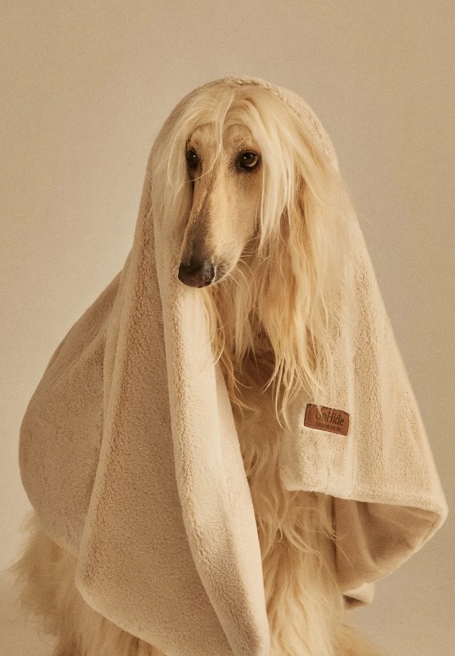
UnHide checks every conversion box in the book, reviews, financing, trust badges, an actual Netflix collab, and somehow never stops feeling human. A look at the photography, sizing, and small details that make the checklist and the heart work together.
-
This Is Lit! Moody Incense
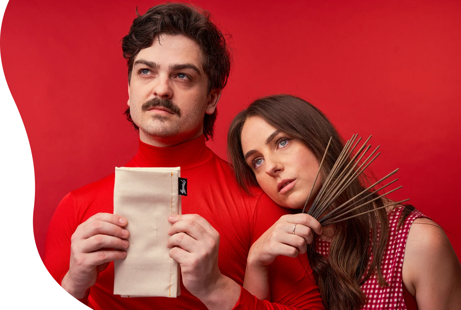
I reviewed 180 DTC websites in a single day, and they all blurred together. Then I found Moody Incense, a three-product incense brand that proves personality beats production budget on nearly every screen, right down to the 404 page.
-
Oh Deus Meus! – Teenage Engineering

Teenage Engineering doesn’t just reskin its product pages, it rewrites their entire vocabulary. FX becomes pocus, pads become paeds, and even the changelog gets its own comic strip. A look at what happens when a brand goes all the way into every world it builds.
-
Bite-Size UX, Week #3
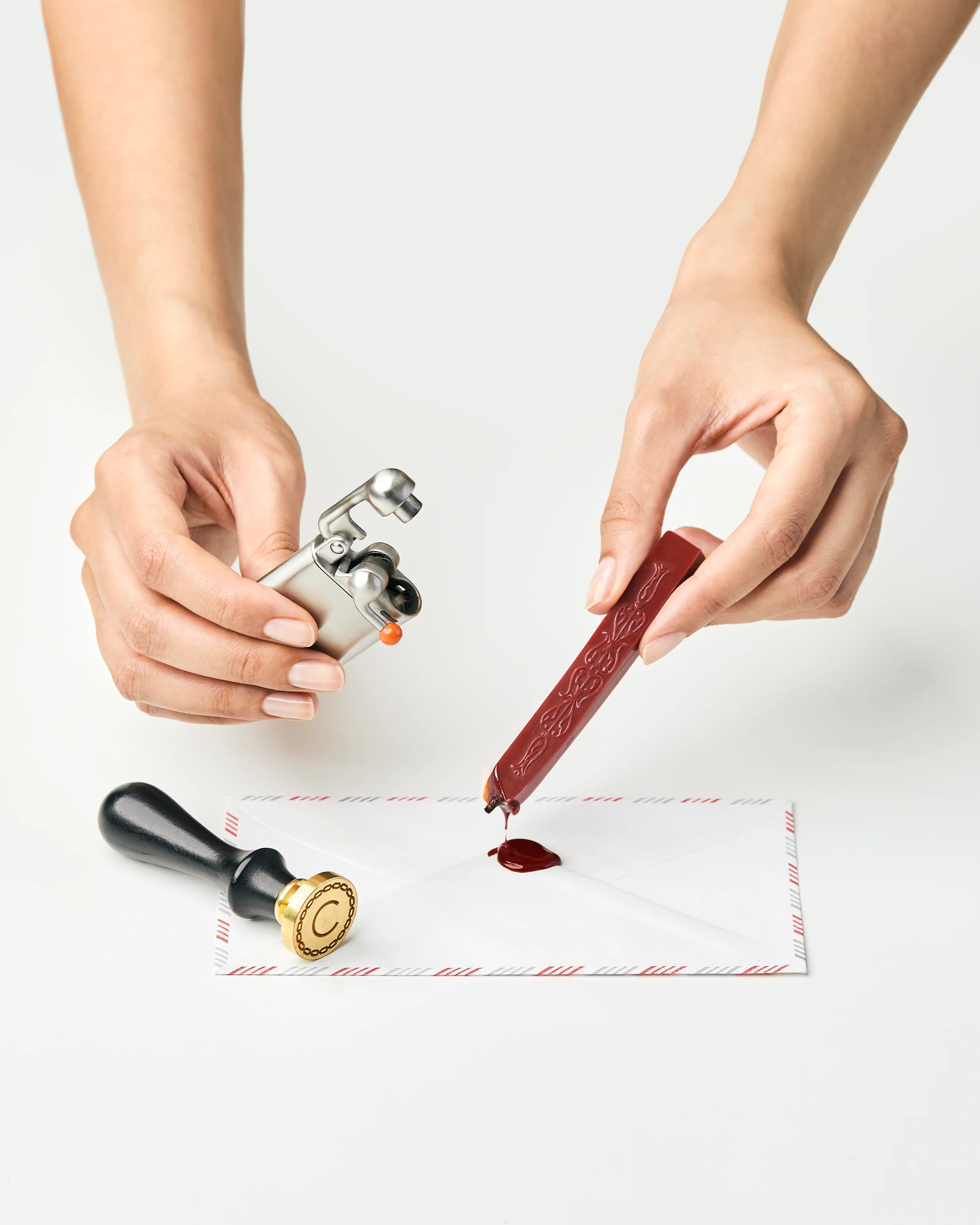
Four small decisions that do a lot of quiet work: a comparison table that sells on pronounceability instead of numbers, a banana that explains size better than any spec sheet, a lighter photographed like a ceremony instead of a tool, and a dosage chart that turns a spray count into a confession.
-
Wrapper’s Delight: Maeve Chocolate

A chocolate store with no product above the fold. How Maeve turns curiosity into a discovery engine, and why great branding alone never gets you there.
-
Play It By The Nose: D.S & Durga
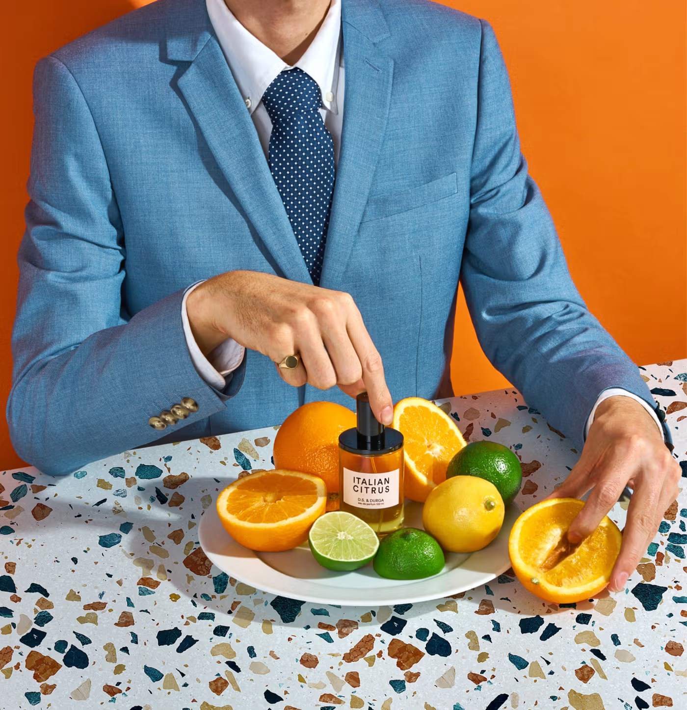
You cannot smell a website, and D.S. & Durga barely tries to solve that. The Brooklyn perfume house routes around the missing sense instead, with a notes rail that works like a spec sheet, liner notes written as autobiography, a Spotify playlist per fragrance, and a layering set that is essentially Clue with bottles.
-
Why the Sour Face? Final Boss Sour Candy
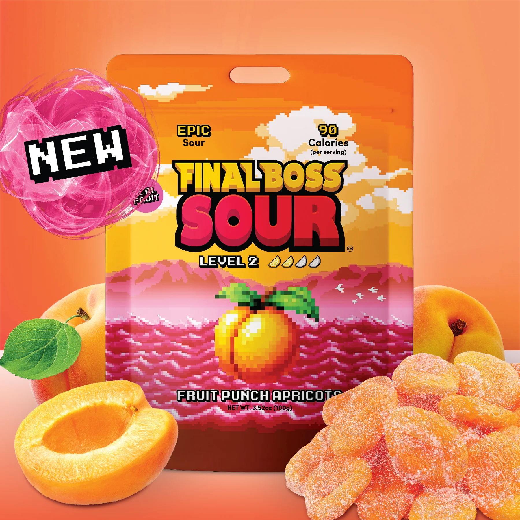
Final Boss Sour didn’t add a game theme to a candy site. It built an actual game, levels as navigation, lore as flavor differentiation, a map with unfinished paths, and a leaderboard, then hung a sour candy brand off the structure.
-
Sleeping On It: Loftie

Sleep deprivation is the worst, and Loftie’s whole site seems to know it. Dark photography, toggles that let you confirm a claim yourself, and a return policy pun good enough to make you smile at the fine print.
-
Bite-Size UX, Week #2

The difference between a site that converts and one that almost does is rarely a missing feature. It is usually a small decision someone made, or didn’t.
-
Seeing the Bigger Picture: SunGod
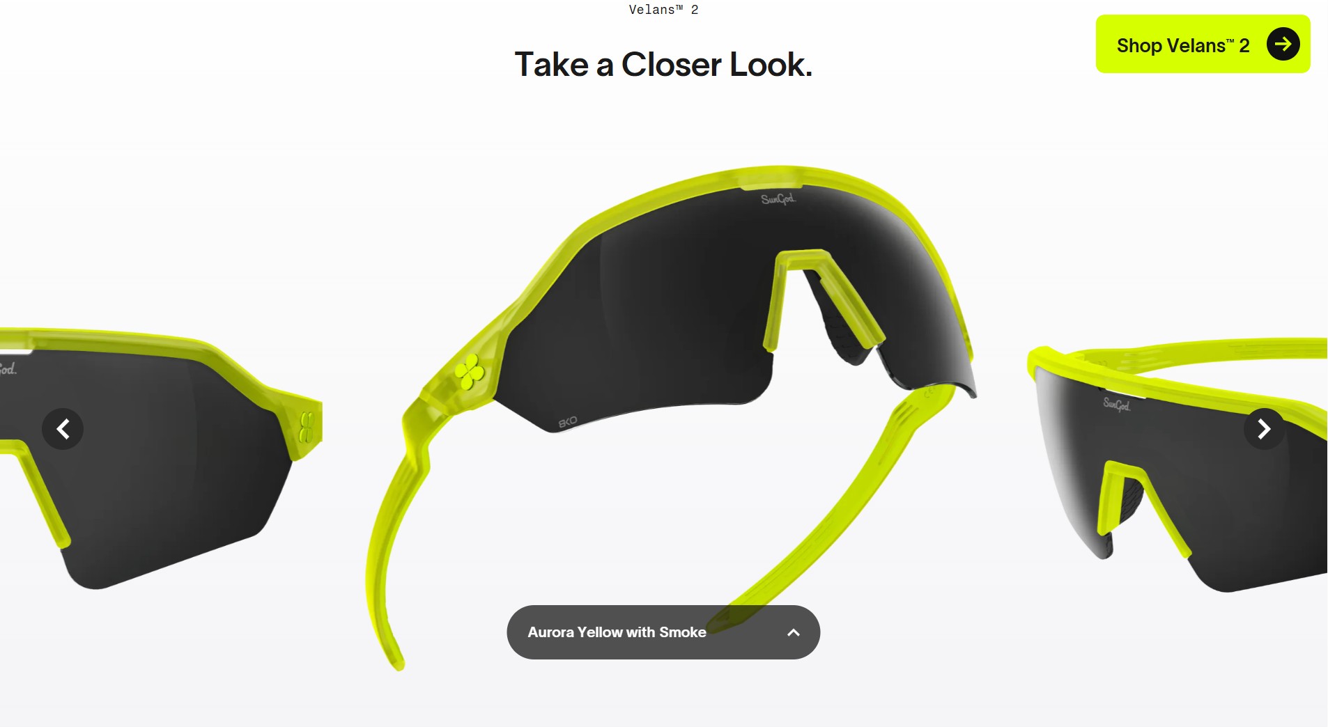
Most eyewear sites ask the customer to guess. Which tint, which fit, which lens for which weather. SunGod decided that was not the customer’s problem to solve.

DEE2SEE
DTC websites review from a creative ecommerce UX lover