
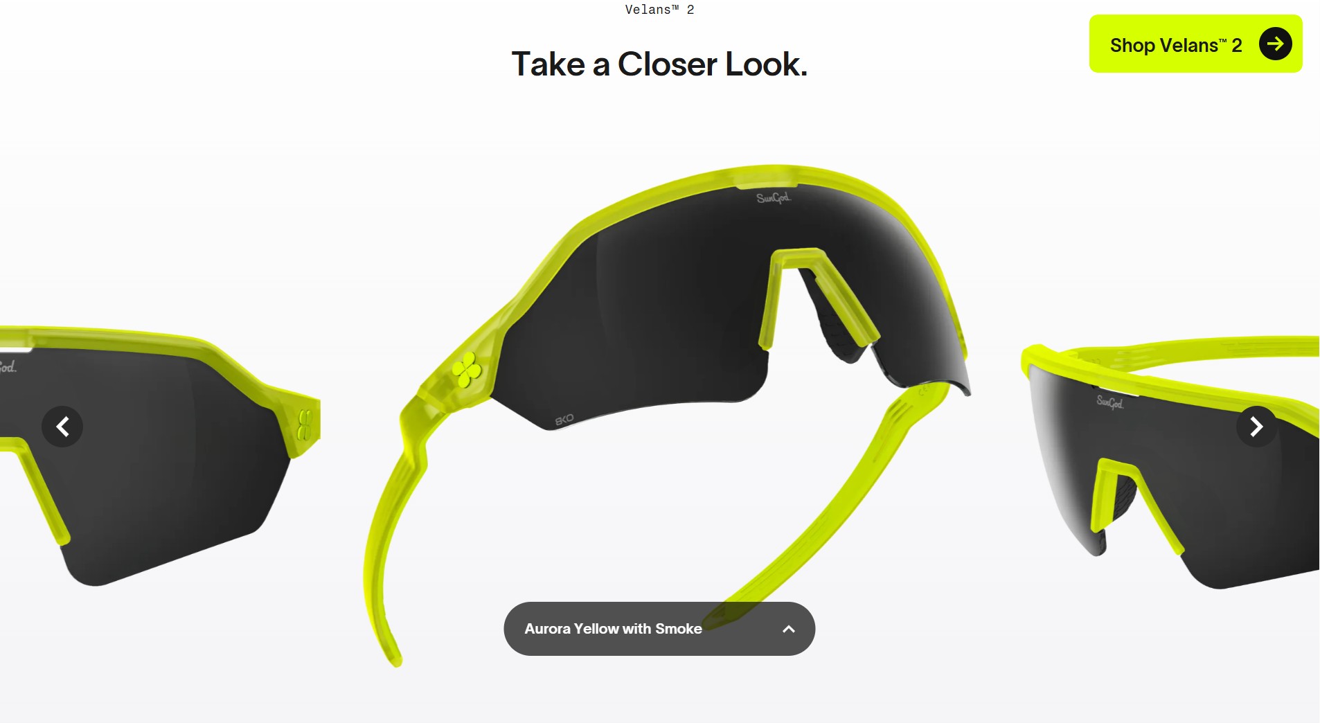
There is a moment in most online eyewear purchases where the customer just gives up trying to understand and picks something that looks nice. The tints have names like “Gold Mirror” and “Smoke,” the specs say things like “Category 3,” and the only way to know what any of it actually means is to already know. Most brands have decided this is fine. The customer will figure it out, or return the glasses, or buy something different next time.
SunGod decided it was not fine.
What Sungod website is, isn’t just a well-designed ecommerce site. It’s a system for converting a physical, sensory purchase into something a person can make a genuinely informed decision about from a screen. Every major section of the site is answering a different version of the same question: how do we give the customer back the confidence they would have had if they could try these on in a mountain sports shop, held them up to the light, and asked a knowledgeable person standing next to them which lens they actually needed for a Tuesday morning trail run?
The answer, it turns out, involves a draggable slider, a radial scoring system, a three-tier comparison table, a photochromic product card, and a lifetime guarantee. But those are just the tools. The thinking underneath them is what’s worth paying attention to.
The lense is the decision
Most eyewear sites treat the lens as one attribute among many. SunGod treats it as the decision. The lens guide is not a page you navigate to separately. It lives inside the product flow, accessible from both a thumbnail you can’t miss on the gallery, and as a link next to the shopping section. When you open it, you get a split-screen experience that takes up the full viewport: the lens spec panel on the left, and on the right, a draggable before/after slider set against a real-world scene.

The scene is adjusted to the shopper type – you have three options to view for the causal collection, and three different ones that represent sports’ related trails, for the sports collection. The left side of the slider shows “Naked Eye.” The right side shows the world as it looks through that specific lens. When you move the handle, the tint shifts across the image in real time. When you switch between lens colours, the tint changes instantly, and the product render on the left updates to match.


This is doing something that most brands have never attempted and that AR try-on tools have mostly failed to do: it is showing the customer what they will see, not just what they will look like. That is a fundamentally different problem to solve, and it requires understanding that the person buying running sunglasses is not buying an accessory. They are buying a relationship with light.

Below the scene, the panel also shows VLT (Visible Light Transmission) as a percentage and Abbe Value as a number. Wha’t an Abbe Value? Is this Abba’s Holographic Show new merch? Well, no. The Abbe Value measures chromatic aberration, which is how much light distorts as it passes through the lens material. It is the number that tells you, precisely, how clear a lens is. SunGod’s proprietary 8KO nylon lenses achieve an Abbe Value of 52, compared to 31 for standard polycarbonate. Most brands do not surface this number at all. SunGod makes it readable at the product level, with a tooltip for anyone who wants to go deeper, and leaves it alone for anyone who does not.

The lens comparison table does the same work in a different register, and with rather more persuasion baked in. It stacks the three tiers additively: Standard comes with anti-scratch coating, 100% UV protection, and impact resistance. Polarised adds anti-glare filter, enhanced contrast, and reduced eye strain. 8KO Polarised adds 70% clearer vision, ultra durability, and 20% lighter weight. You can see exactly what each step up buys you.

The copy stays neutral throughout. But the 8KO Polarised tier is rendered in blue, sits inside a highlighted card with a border the other two tiers do not have, and carries a summary line that reads “Most Popular for Elite Performance.” The information is objective. The presentation is not. It is a quiet but effective piece of visual persuasion that lets the customer feel like they arrived at the premium option themselves, which is, of course, the point. SunGod gives you both the logical case and the emotional nudge, and makes each one feel like the other.
The activity is the context
The lens tool solves the sensory gap. The activities and conditions scoring system solves the situational one.

Every product page carries a scoring panel that rates the glasses across six sports on a scale of 1 to 10, and across five weather conditions. When you switch lens colours inside the guide, the condition scores update to reflect how that specific tint performs in that specific weather. A gold lens scores 10/10 in bright sun and 3/10 in heavy rain. A photochromic Iris lens shows a VLT range of 34% to 79% and earns a different icon layout entirely, accompanied by a short explanation: “Our 8KO Iris Photochromic lens adjusts to fast-changing light conditions, for no lapse in vision and ultimate focus.”
This is an important move. The customer is not choosing a color. They are choosing a tool. SunGod’s scoring system makes that concrete by grounding the choice in conditions the customer already understands from their own sport. A trail runner standing in front of the Airas product page does not need to know what VLT means. They need to know that the amber lens is good for 8 out of 10 runs but will struggle when the cloud cover drops.
The same logic extends to fit. The Size and Fit section rates each model across head size, gender alignment, and face shape for the causal models.

These are not vague claims. The Airas are flagged as medium-to-large, which a reviewer who wears them on a small head can confirm from experience, and SunGod surfaces it anyway. That kind of pre-emptive honesty, the acknowledgment that this model is not for everyone, is exactly what converts a skeptical first-time buyer into someone who comes back.
The sport is the entry point
Before the customer reaches any of these decisions, SunGod has already been making choices on their behalf. The product navigation does not lead with style or price. It leads with activity, which is then divided into specific styles- Trail Running isn’t the same as Road Running as it turns out. If I were a runner, I would have known that – but this is not a website for coach potatoes like me. It is a website for the passionate ones.
The activities carousel on the homepage does not present generic athletes against a white background. It shows a triathlete bent over their bike mid-effort, a golfer at the exact moment of the swing, a road runner with a race number pinned to their chest. The models are not wearing the glasses. They are doing their thing.


The filtering panel reinforces the same principle – when you enter a sport-based category, you first see the subcategories and only then the “standard” filtering options: lens and frame color, but also filters for Lens Tech and Face Size. You can filter the entire catalog by head fit. That is not a feature. That is the brand knowing that a customer who has bought the wrong size of running glasses once will never buy the wrong size again if you give them the option not to.
The guarantee is not a policy
The most significant thing on the SunGod site is not a tool or a feature. It is three words, rendered in heavy black type against a high-visibility lime background: “Guaranteed for Life.”
Sport involves falls. It involves grit in lenses and branches across faces and moments where the glasses hit the ground at exactly the wrong angle. SunGod’s customers are not brunching. They are doing things with real consequences, and their equipment is in the line of fire. The “Broken it? We repair it.” banner is not reassurance aimed at the risk-averse. It is recognition of the customer’s world. These people break things. The brand already knows this and has built the business model around it.

The lifetime guarantee functions, in UX terms, as a decision-simplifier of the highest order. It removes the last residual hesitation from a purchase that already involves lens technology specs, sport-specific scoring, and face shape compatibility calculations. By the time a customer reaches the price, they have already been walked through what they will see, what conditions the lens is built for, how the frame will sit on their specific face, and what happens if the whole thing gets destroyed on a mountain. The only question left is which configuration they want.
The McLaren F1 collab, the INEOS Grenadiers partnership, the B Corp certification card, the “Worn By You” section on individual product pages where customer photos each carry a small product render of the exact colorway being worn: these are all doing the same work. They are closing the gap between “this brand seems credible” and “I am the kind of person who wears these.”

Takaways:
-
Think about the gap between your product and your customer’s ability to understand it. Not the styling gap, not the imagery gap. The comprehension gap. What does your customer need to know to feel certain about their choice, and where are they currently being asked to guess?
-
For most products, that gap is bigger than the brand realizes. Eyewear brands assumed for decades that customers would accept “Smoke” as a sufficient description of a lens. SunGod built a draggable scene simulator, a VLT percentage, a conditions score, and a face shape rating instead.
Start with one dimension of uncertainty your customers face before buying. Will it fit? Will it work in the conditions I use it in? Is the material actually better, or is that marketing? Pick the one that costs you the most abandoned carts and build a single tool that answers it directly. It does not need to be the lens simulator. It could be a comparison table structured as “Standard includes X, Premium adds Y and Z.” It could be a face shape guide with honest suitability scores. It could be a before/after visual for any product where the difference between options is hard to see in a static image.
AI tools have made this kind of asset significantly cheaper to produce than it was three years ago. A lens preview environment, a conditions scoring grid, a face shape compatibility calculator: these are no longer bespoke engineering projects. The question is whether your brand has decided the comprehension gap is your problem to solve, or the customer’s problem to live with. -
Once you have reduced the big decisions, go looking for the small ones. Every question a customer has to answer for themselves before clicking is a small amount of friction. SunGod filters by face size. That is one question removed. One fewer reason to pause. Across a checkout flow, a product page, a lens guide, those removals compound. The customer who arrives at “add to cart” having never felt confused or uncertain is not just more likely to convert. They are more likely to come back.
Dee2See by Lihi Lothan reviews DTC ecommerce experiences for brand managers and growth teams. We look at what happens between “I’m interested” and “I bought it.”


