Scroll down a Touchland product page and you’ll hit a section labeled Top Notes, Heart Notes, Base Notes. But before the ingredients, there’s a mood. “Juicy & Playful.” “Soft & Delicate.” “Crisp & Invigorating.” One evocative line that tells you how the scent is supposed to make you feel before it tells you what’s in it. Then the pyramid: ripe bergamot and steamed eucalyptus up top, fresh grapefruit and vetiver roots in the heart, warm hinoki and rich amber underneath. Emotion first, composition second. And each tier has its own styled visual arrangement of ingredients, not a shared template with swapped labels. The top notes are composed differently from the heart notes, which are composed differently from the base notes, the photography mirroring the temporal logic of how a fragrance actually unfolds on skin: fast and bright at the top, fuller in the middle, deeper and slower underneath. Someone sat down and made those styling decisions per tier, across every scent in the catalog. It reads like the back of a Le Labo box, the kind of structured scent breakdown you’d expect from a perfume house justifying a three figure price tag.
It’s a $10 hand sanitizer.

That’s the whole move ladies & gentlemen. Touchland didn’t dress up a hygiene product with nicer packaging and call it a day. They took the entire information architecture of fine fragrance, the notes pyramid, the editorial photography, the language of mood and memory, and applied it wholesale to a category whose only real job used to be killing germs without smelling like a hospital. It’s the same instinct we talked about with Last Crumb: pick a category’s codes, commit to them completely, and let the commitment do the convincing. Last Crumb borrowed luxury’s friction. Touchland borrowed fragrance’s ritual.
Worth pausing here to orient. Touchland has two product lines. The original one, launched via Kickstarter in 2018, is the Power Mist: a hand sanitizer in a pocket-sized spray bottle, now ranging from $10 to $12. The newer line is the Power Essence: a body and hair fragrance mist, priced at $20. Two different products, two different use cases. The same visual system, the same fragrance-house vocabulary, applied to both without exception. That last part is what makes it a strategy rather than a lucky brand moment. It would be easy to justify the fragrance editorial treatment for a product that actually smells like something you’d wear on purpose. Applying it to a hand sanitizer, where the functional ceiling is “doesn’t smell like a hospital,” is the bolder bet, and the one that set the whole reframe in motion.
Something Borrowed
There’s a reason that borrowing actually lands instead of feeling like a costume. Hand sanitizer has a sensory aftermath nobody talks about directly, that tight, slightly stripped feeling on your skin once the alcohol evaporates, the sense that you’ve done something necessary rather than something good for yourself, on top of a smell that, even at its best, reads as clinical rather than pleasant.
That’s the real gap Touchland is closing. Not the packaging, not the marketing language, but the actual physical experience of using the product. A notes pyramid and a hydrating formula aren’t there to distract you from the fact that you’re sanitizing your hands. They’re there to replace the unpleasant part of that ritual with one that feels closer to spritzing on a fragrance you chose for yourself.

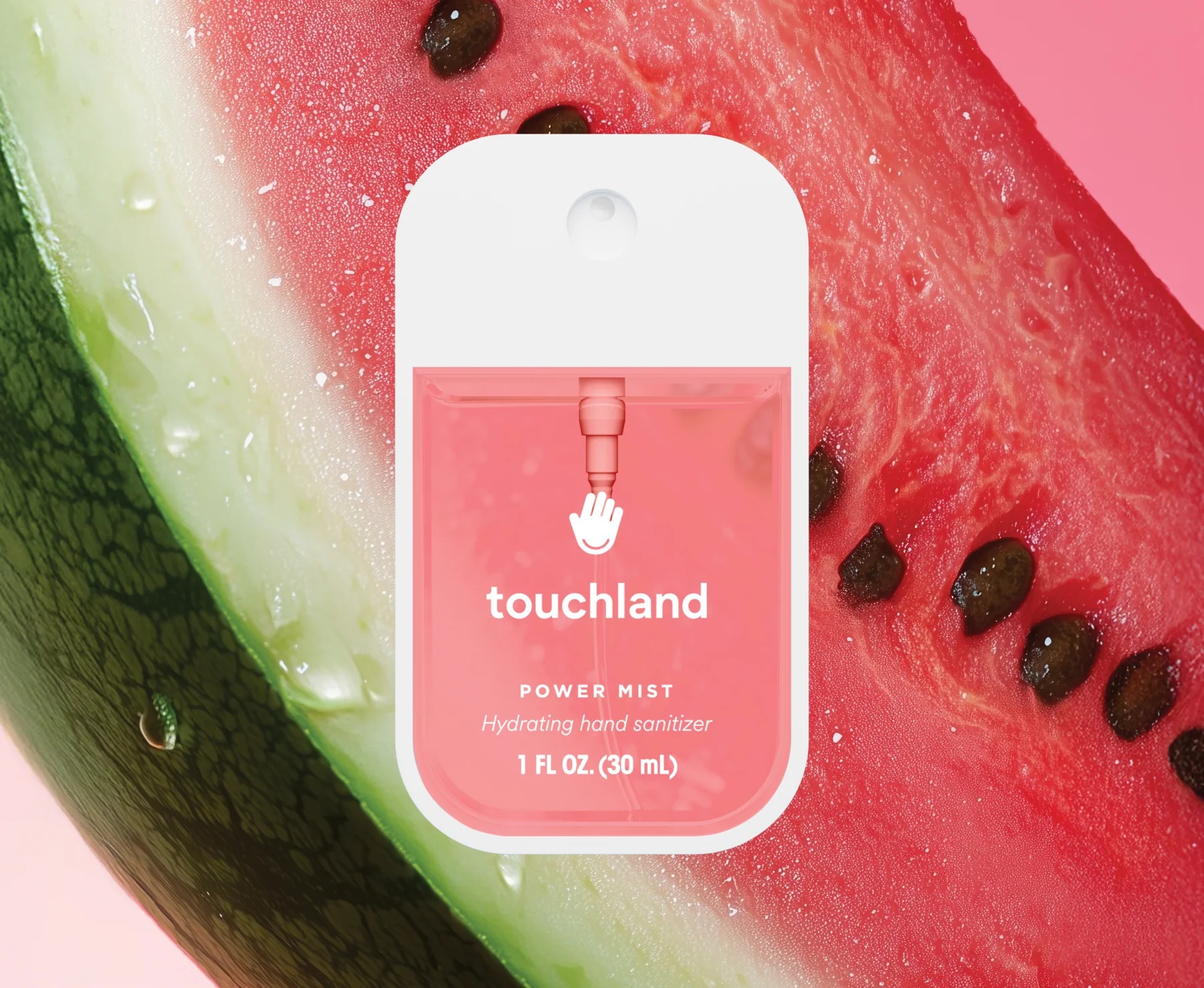
100 Per Scent
The notes pyramid isn’t a one-off flourish either. Every scent gets its own commissioned – and may I say, even seductive visual, and not just on the mists: Wild Watermelon Hand Sanitizer sits against an extreme close-up of watermelon flesh and seeds. Vanilla Velvet is framed inside the petals of an orchid, pollen catching the light. Who knew pistachio shells could be so erotic???
I guess the images were generated (further down the page there’s also a delicate video of the elements moving) – but I really couldn’t care less about the production aspect of it (shot or generated). The result reads as deliberate, lit and composed like a fragrance campaign, color-matched to the liquid inside the bottle. Either way there’s no commercial reason to invest that level of visual craft into a $10 hand sanitizer unless the imagery itself is part of what you’re selling. Scroll through the catalog and the effect compounds. They are SO gorgeous you just want to check the next scent, and the next, the same pull a perfume counter creates when each bottle is staged like its own small still life. Multiply that across more than a dozen scents in two product lines and you’re looking at a level of investment that has nothing to do with selling hand sanitizer and everything to do with selling the idea that this hand sanitizer deserves the same visual treatment as a fragrance launch.


The Scroll That Teaches You to Layer

Keep scrolling and the page does something most cross-sell modules don’t bother with. Under a section titled Start Layering, the product photography shifts as you scroll, citrus and cedar behind one bottle, mango and leaf behind the next, while a short list of products stays put beside it. It’s a parallax effect, but it’s not there for spectacle. A perfume counter would tell you to layer scents and leave you to figure out the combination yourself. Touchland turns the scroll itself into the instruction, walking you through how layering actually feels, one note shifting into the next, instead of just placing three bottles side by side and calling it a bundle. Most brands selling complementary products lean on a static “frequently bought together” row. This one built the interaction to demonstrate the behavior it’s trying to teach.
This Is Fashion Photography
The homepage commits just as hard. There’s a video of a model in a silk slip dress standing in frame with no product visible at all, the kind of footage that exists purely to set a mood, the sort of thing you’d find on a fashion brand’s lookbook page, not a CPG site. The “Bag Charm” section goes further: a woman holds the sanitizer case up by its keyring the way you’d hold up an earring, another shot shows it clipped to a tote next to a silk scarf, styled like an accessory collaboration rather than a hygiene product photographed in use. The homepage tagline doesn’t mention germs or protection. It says Move Your Mood. That’s not incidental copy. It’s the same emotional register fragrance brands have used for decades, scent as self-expression rather than function.

What’s striking is that this isn’t lifestyle photography in the loose, stock-image sense most DTC brands mean by it. It’s fashion photography, full stop, with the styling, lighting, and casting to match. A redhead in a cropped red dress and matching lipstick holds the sanitizer up at eye level, lit and posed the way a magazine would shoot a fragrance ad, not a product demo. A model in a bold, color-blocked outfit is shot mid-stride against a plain backdrop, the product almost incidental to the composition, the way a runway-adjacent campaign image works. Even the macro shots of the scent ingredients carry that same charge. The brand isn’t borrowing one fashion reference. It’s running a full art direction, consistent across people and objects, and that consistency is what makes it feel like a coherent world instead of a few nice photos scattered across the site.
Look at the Performance line and the borrowing gets even more specific. Where the fragrance mists live in soft floral editorial, the Performance Body Sprays shift entirely, a kid mid-sprint on a beach, a surfboard half buried in sand, headphones tossed on a towel. It’s the same trick fashion brands run with sub-lines: different occasion, different visual world, same underlying system. Touchland isn’t running one aesthetic. They’re running a wardrobe of them, and assigning each product line to the lifestyle it’s meant to slot into.
Designed to Be Seen
There’s a behavior Touchland understood before they designed a single product: since COVID, people have been attaching mini hand sanitizers to their bags. The product moved out of pockets and into public view, clipped to backpack straps and keychain rings, visible every time someone reached for their keys. Nobody was proud of it. It was practical, slightly embarrassing, the kind of thing you’d use quickly and put away.
Touchland looked at that exact behavior and made a different product decision. The Crocs collaboration takes that logic to its obvious conclusion: Crocs built a cult around making an “ugly” product desirable through the right collaborations and the right people, until being seen with it became a statement rather than an apology. The Touchland x Crocs case, covered in charms, held up at face level like jewelry in its own campaign photography, is the same idea applied to a hand sanitizer. You don’t clip it to your bag despite how it looks. You clip it because of it.

The Collectibility Engine
In addition to Crocs, Touchland has run brand collaboration also with Disney, complete with charm-covered cases and Mickey Mouse ears. When the Disney collaboration went live, it amassed a waitlist closing in on 8,000 people within hours. Other current collaborations you can find on the site are Hello Kitty and Peanuts. That’s not a marketing stunt bolted onto a hygiene brand. That’s a collectibility engine, the exact mechanic that drives people to camp out for sneaker drops or hunt down a discontinued lipstick shade, repurposed for a product that used to live in the same aisle as rubbing alcohol.

The Basket Case
It shows up in how people actually shop the site too. The founder has said that people now buy six or seven units at a time to use a different scent every day of the week, the same way you’d rotate fragrances. Touchland’s average order value sits around $45, which only makes sense if the cart is built to encourage exactly that kind of multi-scent collecting, and the site does its part. The cart itself is a solid, if unremarkable, piece of CRO: a milestone shipping bar nudging you toward the next discount tier, a subscribe and save toggle sitting right on the line item instead of buried in account settings, upsells pulled from the same fragrance family rather than random cross-sells. None of that is the differentiator. It’s table stakes, executed well.

The one place the funnel sounds like every other DTC store is the shipping protection add-on at checkout, a small, easy to miss fee tacked onto the order. It’s not unreasonable on its own, package theft is a real cost and the sum is small. But it’s the one moment that runs on ordinary ecommerce defensiveness instead of the elevated experience built everywhere else, the single seam in an otherwise tightly controlled illusion.
The Price Tag Is the Proof
Which is what makes the price tag the actual punchline rather than a footnote. A bottle of Purell generally sells for under $5. Touchland’s hand sanitizers sell from $10 to $20 at Sephora. That gap isn’t a brand getting away with charging more for the same thing. It’s the receipt. Touchland proved there’s consumer appetite for hand sanitizer at above commodity prices, the same thing Starbucks did for coffee and Rao’s did for spaghetti sauce. You don’t get people to pay four times the category price by making the bottle prettier. You get there by convincing them they’re not buying a hygiene product at all.

Takeaways
-
If your product lives in a category nobody gets excited about, borrow the information architecture of a category people do get excited about, not just the visuals. A notes pyramid, a tasting menu, a fit guide, whatever structure signals expertise and ritual in an adjacent industry, can be repurposed wholesale if it’s applied with full commitment rather than as decoration.
-
Budget for photography per SKU if your product line has real variation worth showing. A shared template with swapped colors reads as efficient. A dedicated visual per scent or per variant reads as a brand that thinks each one deserves attention, and customers notice the difference even if they can’t name it.
-
If you want repeat purchasing, give people a reason to buy more than one. A subscribe toggle increases retention. A reason to own the whole set, through collaborations, limited editions, or genuine variety worth collecting, increases basket size today.
Dee2See reviews DTC ecommerce experiences for brand managers and growth teams. We look at what happens between “I’m interested” and “I bought it.”


