Most eCommerce brands treat the checkout process like a race. They cut steps, shorten pages, and obsess over reducing “clicks to purchase.” They optimize for pure transaction speed. And then there’s Last Crumb.
They sell a box of 12 cookies for $160, and a curated box of 6 for $80. It takes three whole days just to prepare an order. By every traditional Conversion Rate Optimization (CRO) rule book, this business model should crash and burn. Yet, they sell out in flash “drops” like limited-edition Jordans.
The truth is, you cannot sell a commodity at a luxury price point using a standard Shopify grid. To overcome that extreme financial friction, Last Crumb threw out the traditional best-practice playbook and designed a unified conversion system. They mapped user psychology, intentional friction, and high-contrast storytelling into a single, high-converting digital narrative.

Narrative Friction and the Psychology of the “Earned” Purchase
Standard conversion optimization treats friction as the ultimate enemy. The goal is always to reduce cognitive load and move the user to checkout as fast as possible.
Last Crumb reverses this entirely: They use friction as a value driver.
When a user encounters a luxury price tag on a casual product, their logical brain immediately triggers price resistance. Speed invites logic. To bypass this, Last Crumb treats their product pages (PDPs) as massive, towering vertical journeys. They force the user to “work” and scroll through an extensive layout before they ever see an option to buy.
This structural choice leverages a powerful behavioral principle known as the Labor Illusion. When consumers are forced to experience the narrative scale and “work” of a presentation, their perception of the product’s value rises exponentially. The length of the page mirrors the premium nature of the product. By the time the user reaches the bottom, their brain has invested time into the scroll, transforming the purchase from an impulsive transaction into an earned reward.


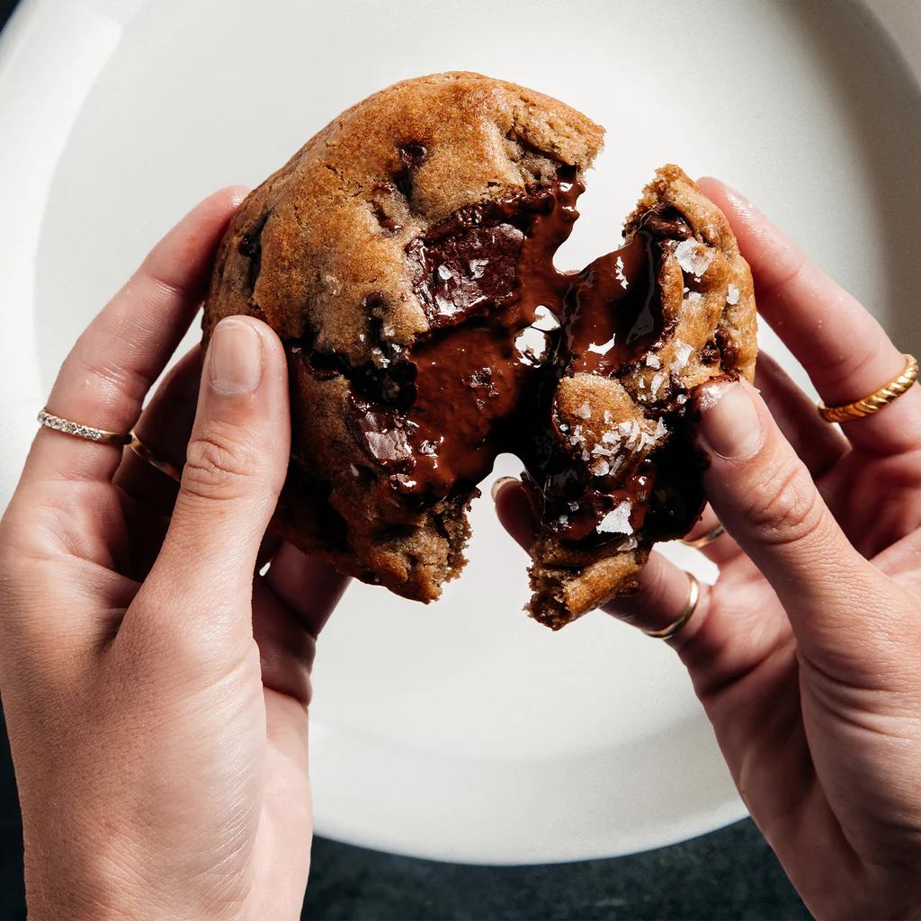
Unapologetic Food Porn: Visuals Built for Screen-Licking
No plates, no crumbs on a counter, no cozy bakery backdrops. By stripping away environmental signals, the cookie stops looking like a baked snack. The extreme resolution elevates every crystal of flaky sea salt and every fissure of cracked, glossy chocolate into intentional architecture. The image treats the product with the exact isolated reverence a luxury jeweler reserves for an unmounted diamond.
Let’s talk about the imagery, because calling it “product photography” feels like an insult. Last Crumb pioneered an aggressive, high-contrast form of sensory engineering.
The cookie isn’t sitting on a cute, rustic plate next to a glass of milk. It is cropped so tightly that it threatens to spill over the borders of your monitor. The texture is hyper-real. You can see the distinct, architectural crunch of the chopped peanut crisp topper, the glossy, sticky pull of the toasted marshmallow center, and the mathematically perfect lines of the melted peanut butter drizzle running down the side.
This isn’t designed to be polite; it’s designed to make you want to physically lick your glass screen. By capturing the precise physics of food – the exact way chocolate pools or how marshmallow toasts – the UX triggers a physical, visceral reaction before you ever read a single word of the recipe. The visuals satisfy your sensory cravings, entirely overwhelming the part of your brain that usually cares about a double-digit price tag.


Time as an Ingredient: Converting Logistics Constraints into Brand Equity
We live in times where super speedy delivery is a competitive edge. Forget 1-hour delivery time, there are now 10-min time slots, so when Last Crumb’s delivery time includes a three-day preparation delay – that could mean a massive checkout leak. But Last Crumb solves this by turning an operational bottleneck into their core differentiator, with its “3-DAY BAKING PROCESS” with the primary header “TIME IS A LUXURY.”
Instead of hiding or minimizing the wait time, the system forces the user to actively click through the individual days to understand why the product takes 72 hours to prepare. The copy under the active “DAY 1” tab explains the method of caramelizing European high-fat butter a day in advance of the dough, concluding with an uncompromised trust anchor: “Machines can’t do this – it requires a real human to ensure it’s done right.”
By the time the user interacts with this narrative layout, the three-day wait is no longer a logistics drawback. It has been rebranded as a mandatory artisanal process that ensures culinary excellence.


Microcopy as an Emotional Disarming Machine
Most eCommerce copy is written to inform. Last Crumb’s copy is written to pick a fight with your inner skeptic, and win.
When a user sees an $80 price tag, their brain immediately scrambles for an excuse to say no. The most common defense mechanism? Nostalgia. “My sweet old grandmother makes chocolate chip cookies for free.”
Last Crumb doesn’t try to politely argue with that thought. They pull up to the core collection menu, list out cookie “Nº1 BETTER THAN S*X,” and drop a bomb on your defense mechanisms.
The primary Call to Action button doesn’t say “Add to Cart” or “Buy Now.” It reads, with absolute, unbothered confidence:
“Sorry, Grandma.”

When a user sees an $80 price tag, their logical brain immediately scrambles for an excuse to say no. The most common defense mechanism is nostalgic logic: “My sweet old grandmother makes chocolate chip cookies for free.”
Last Crumb doesn’t try to politely argue with that thought. They lean entirely into the unapologetic naming of the cookies to establish an unassailable luxury context.
Look at this cookie here – it’s not a banana cream pie cookie, it’s “DONKEY KONG”: “This cookie is bananas. Like, actual banana, not the fake kind that our chemists will have to lie about years down the road. We don’t even have chemists.”
By using irreverent, hyper-confident language, they destroy the product’s comparison to grocery store baked goods. They shift the product into an entertainment and luxury category where price anchors no longer apply.
This attitude is anchored directly into the microcopy of their interaction points. The primary Call to Action (CTA) buttons on their collection screens do not use generic, passive phrases like “Add to Cart” or “Buy Now.” “ For the Donkey Kong cookie the CTA reads: “This Sh!t Is Bananas.”
These buttons turn a standard transactional milestone into an emotional trigger. It forces the user to actively click a phrase that validates the brand’s premium identity, removing friction by turning the checkout flow into a game of status and indulgence.
They carry this relentless tone through their core brand positioning screens. On the About page, the typography is the entire design layer. Massive, roaring white text dominates a pure black background:

The word AUDACIOUS is struck through with a crude red line, and a stylized cartoon skull replaces the letters in the word COOKIES.
It breaks every traditional layout rule in corporate design. It tells the user that this brand is too obsessed, too reckless, and too elite to care about industry standards. If the copy is this unfiltered and confident, your brain subliminally assumes the product must back it up. Every word, headline, and button works in tandem to systematically dismantle the user’s rational armor, clearing a direct psychological path to the purchase decision.


The Father’s Day Pivot: Empathy via UX Hierarchy
If a well-meaning adult buys their conservative, traditional father a luxury cookie box, and Dad opens it up to see giant labels screaming “BETTER THAN S*X” or “WHAT THE F*CK VELVET,” the user experiences anticipatory friction. They worry about making things awkward. They fear the receiver will feel intimidated or confused by the provocative branding.
Last Crumb diagnoses this beautifully in their more official promotion sales days, such as Mother’s and Father’s Day:

On these pages, they completely flip the visual hierarchy of the product naming:
- Instead of leading with the provocative title, the giant, bold white text clearly states the safe, classic flavor: CHOCOLATE CHIP, CHOCOLATE LAVA, or PEANUT BUTTER.
- The edgy, original internal names are demoted to smaller, quiet red text tucked neatly underneath.
They don’t lose their signature wit, but they strategically lower the volume. By making the packaging feel instantly recognizable and safe for a father, they eliminate the buyer’s hidden social anxiety. It’s a profound display of conversion empathy: modifying the interface layout to protect the gift-giver’s peace of mind, ensuring the sale goes through flawlessly.
The Takeaway:Own Your Defects to Create Your Best Effects
If your business model has an obvious weakness – whether it is an astronomical price point, a massive shipping delay, or a highly polarizing brand identity—your instinct is usually to mask it. You try to explain it away in a polite FAQ section or bury it behind an industry standard layout.
Last Crumb proves that trying to look “normal” is a losing strategy for a premium brand. True conversion architecture doesn’t hide defects; it amplifies them until they become the exact reason the customer buys.
When you align user psychology, business constraints, and precise verbal hooks into one integrated flow, you stop defending your weaknesses and start leveraging them:
- Turn high price into narrative scale: If your product costs double the market average, do not speed up the checkout. Lengthen the layout. Use the physical act of scrolling to slow down the logical brain, giving your imagery and microcopy enough time to build genuine value.
- Turn operational delays into product value: If your production timeline is long, do not apologize for the wait. Build interactive storytelling elements that take the user behind the scenes, transforming an operational bottleneck into proof of premium craftsmanship.
- Turn potential social awkwardness into tailored layouts: If your default messaging is loud and polarizing, recognize when a customer changes their intent from self-buying to gift-giving. Pivot your design hierarchy to lower the social risk for the buyer, intercepting their unspoken anxiety before it stalls the checkout.
Dee2See reviews DTC ecommerce experiences for brand managers and growth teams. We look at what happens between “I’m interested” and “I bought it.”

