FIGS redefines healthcare fashion with a sophisticated eCommerce experience that blends functionality with a touch of glamour. * First published on Medium
Niches are fascinating! Not just the kind you find in walls, but specific fields of expertise, like eCommerce UX, for example. The beauty of a niche lies in the ability to delve deeply into the subject matter and provide tailored, practical solutions to real-world needs.
Take, for instance, the delightful website Figs, a DTC site that began about a decade ago with collections of uniforms for medical staff (commonly known as scrubs). Instead of the typical “boxy” scrubs that make everyone look like a box, Figs’ products are made from unique technology fabrics that combine comfort, softness, wrinkle resistance, moisture protection, and odor and bacteria resistance — perfect for the hospital environment.
Everything on this site speaks of fashion, professionalism, and respect for its customers. And I love it, being an example of a wonderful User Experience, proving that you can create a beautiful, memorable and professional website even if you use a very basic eCom platform template. Here are some highlights from the site that may inspire you:
Homepage
The brand’s vibrant colors are prominently displayed at the top of the page, just below the main banner. This intentional choice showcases the colors rather than the types of items, recognizing that different medical teams wear different colored scrubs. Doctors, nurses, orderlies, radiology technicians, lab workers, paramedics in the field, and more – the colors serve as a sort of human legend in the hospital space. For customers managing or working in private clinics, there is the freedom to choose colors more liberally, and the color carousel serves this purpose well. Note the meticulous compositions for each option, ensuring even those of us who struggle to distinguish between royal blue and sky blue can see the difference.

Visuals
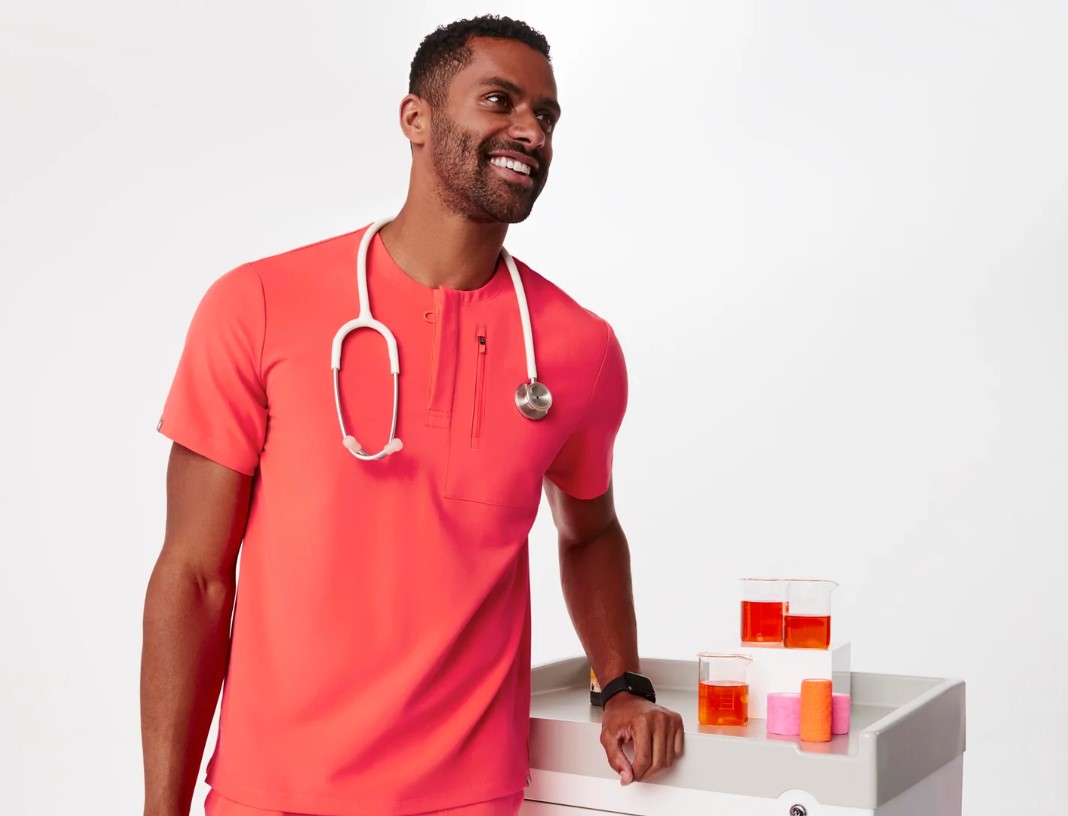
At Figs, there is no such thing as “too many pictures.” The more images of the product from various angles (including videos), the better – especially pictures that demonstrate the features of the item rather than just describing them. One crucial aspect of medical uniforms is the pockets, and as many as possible. Figs not only show that there is a pocket but also what can fit inside in terms of size.


Here’s another example of a visual presentation of a feature rather than just talking about it – a reflective element in the dark on a jacket:

This precise approach of showing what really matters to the target audience is also evident in the choice of icons representing the key features of each product on the product pages. For instance, what’s important on a specific jacket page — number of pockets, its fit, and its suitability for sub-zero temperatures in hospitals:

Like a fashion site, all images are carefully curated – from the background in shades of off-white and gray that honors and highlights the clothing’s colors to the choice of models, representing different ethnic backgrounds and sizes, and the props in the photos themselves – there’s no “just stand with the outfit in a tortured model pose.” There’s always something in the frame – a stethoscope around the neck, a pager (not sure if they still use these or if it just seems logical from the days of George Clooney in ER), a tray on wheels, a mobile X-ray machine (what about the mortitians out there?).

Expanding the Product Catalog
Up until few years ago, the site only offered scrubs, but now the catalog features a variety of products, making it a one-stop-shop – from underwear and non-uniform work clothes for everyday clinic use to comfortable loungewear for between shifts, headbands, bags, and even vests suitable for post-shift outings. Another new category on the site is T-shirts with job descriptions in six languages (check the picture below). One option for wearing this shirt is to show off. They absolutely deserve it. Another option is during tougher periods or environments where it’s important to identify who’s who in the area.

Additional products on the site result from smart collaborations. When you have a niche site with a focused audience, valuable partnerships are the logical next step. Figs collaborates with New Balance, producing branded models that complement an excellent “Shop the Look” (remember, it’s a fashion site), and a stethoscope brand called Eko, with an advanced and unique product.

Personalization
I love this word when it’s not just a vague buzzword, and Figs does it beautifully, especially for a site of uniform clothing. Two examples of product personalization:
Most products can be customized with personal embroidery or embroidery and an icon on the sleeve. The site feature is easy to use and displays the final result already on the product (even if the icons are too small, they become clear after selection). Beyond the personal touch, think eCommerce-wise: Products with customization (embroidery, engraving, color) cannot be returned, eliminating the return and handling process.

Another example of personalization in the uniform world is Pips – buttons that attach to surgical caps or headbands, allowing for comfortable and non-pressured attachment of face masks. On the site, you can choose from a variety of Pips pins for a slightly more personal statement, especially when it comes to full uniforms and face masks.

Catering to Different Target Audiences
The primary target audience is medical staff in small/private clinics, but the site also caters to larger team purchases, including bulk discounts, embroidery options, and personalized service.
Medical students also receive special discounts.

Microcopy
Another nice aspect of niche sites is the ability to use internal jargon. Figs presents precise microcopy that goes beyond the “we have such discounts, you should call the orderly” and speaks in a language that even those in the gift-buying group will understand.

Social & Environmental Values
Figs offers a recycling program for regular uniforms – send them the uniforms, and you get a $50 credit for the site.
Moreover, they embark on projects in developing countries, from establishing organized work processes for local medical teams to specific “missions” like vaccinations, women’s health, child examinations, and more.

If you feel stuck in your site’s activities, this is the presecribed remedy from an eCommerce UX doctor – simply dive into inspring eCommerce websites and immerse yourself in them. Not everything will suit you, but it’ll certainly be the beginning of movement.

