
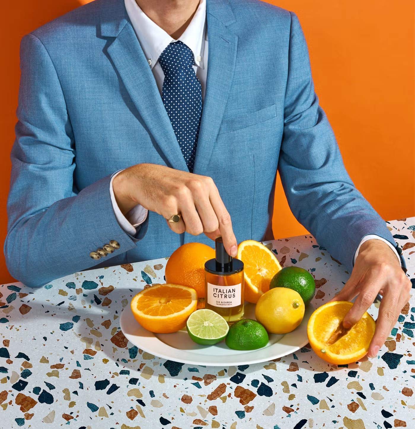
The second note listed for a candle called Concrete After Lightning is panic grass. It is a real plant, a genus of ordinary field grasses, and nobody put it on that page for its taxonomy. Six words in that column and you have experienced a summer thunderstorm in a city, on a screen, through a sense the screen does not have.
That is the problem D.S. & Durga has to solve, and it is harder than the one most ecommerce sites face. A $225 bottle of perfume bought online is a bet placed with almost no information, and there is no zoom function, size chart or unboxing video that closes the gap. What makes this site worth studying is that it barely tries to close it. It routes around it instead. Every significant creative decision here is a substitution: a story, a piece of music, a game or a photograph standing in for a sense the browser cannot deliver.

The House That Built This Language
D.S. & Durga was founded in Brooklyn in 2008 by David Seth Moltz and Kavi Ahuja Moltz, a husband and wife who started blending perfume in their apartment and giving it away as holiday gifts. David is a self-taught perfumer who arrived from music. Kavi is a trained architect who moved into design and became the brand’s creative director. In 2024 the brand was acquired by Manzanita Capital, the London group behind Diptyque and MALIN+GOETZ, which makes the tonal consistency of the site more impressive rather than less. Scale usually sands the edges off writing like this.
The motto in the footer of every page is Perfume is Armchair Travel, and it does more work than a tagline normally does, because it reframes what is being sold. You are not buying a smell. You are buying somewhere to go.

Structure As a Substitute for Nose
The notes rail is the least glamorous thing here and the most useful. Top, heart and base is perfumery’s internal vocabulary, the way a perfumer thinks about how a fragrance behaves over hours. Fixing it in the same position on every product page turns a professional convention into a comparison surface. A customer who knows nothing about perfumery can hold three fragrances against each other on identical axes, which is precisely the job a spec sheet does for a laptop. The information was always there. The decision to render it identically, every time, is what makes it usable.

Liner Notes is the second substitution, and the name is chosen with real precision. A liner note is the text folded into a record sleeve, written by someone close to the music, explaining where it came from. The module keeps that promise by being autobiography rather than product copy. The Debaser note is about a childhood house full of blues and a summer ruled by a Pixies record before it is about fig or tonka bean, and it is signed off with the perfumer’s initials the way a liner note would be. None of it tells you what the perfume smells like. All of it hands you a feeling attached to a place and a time, which is closer to what a person is actually reaching for than any list of notes could be.
While I LOVE these little stories, I do have to admit I’m not sure this UX decision of placing this section so down the product page is correct. If you do this on your website, add a link above the CTA button that will direct the customer to the relevant section underneath.

Then there is the small black playlist button sitting in the corner of each one. Every fragrance has a Spotify playlist attached. This is the least commercial element on the site and probably the most strategically sound, because it is the only one that moves the product into a sense the customer has available while browsing. You cannot smell Debaser. You can hear it. The playlist is not decoration, it is a working substitute for the missing channel, and it costs almost nothing to maintain.

Something happens by the bottom of these pages that is worth naming, because the fragrance category almost never produces it. The dominant sales language of perfume is seduction at a distance. A recognisable face, a word in French, a promise of becoming more desirable to somebody unspecified. It is beautifully produced and largely interchangeable, and it asks you to want the person in the photograph rather than the liquid in the bottle.
This site wants you to want the smell itself. Not the improved version of yourself who wears it, the actual smell, including the ones nobody has ever thought to sell you before. It is sexy in a specific rather than a generic way, quirky without tipping into twee, and mysterious enough that you keep scrolling to find out where the joke lands. By the time you reach the end of that candle page you genuinely want to know what wet asphalt smells like when it steams in the heat, which is not a desire anybody arrives at a perfume site already carrying. It was built on the page, out of words and a photograph and a playlist, in the absence of the one thing that would have done the job instantly.
The Layering
Fragrance layering is having a moment. The Global Wellness Summit named it in its Future of Wellness report for 2026, framing it as a move away from fragrance as a status symbol and toward scent as a creative language, driven largely by younger buyers who no longer want a signature scent that thousands of other people also wear.
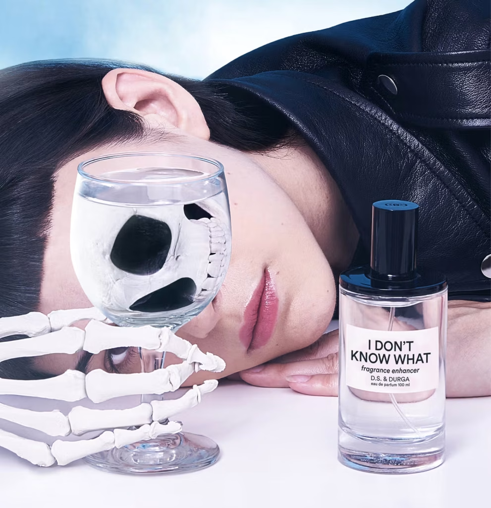
D.S. & Durga’s answer to it is the Murder Mystery Set, which is basically Clue with bottles and fragrances.

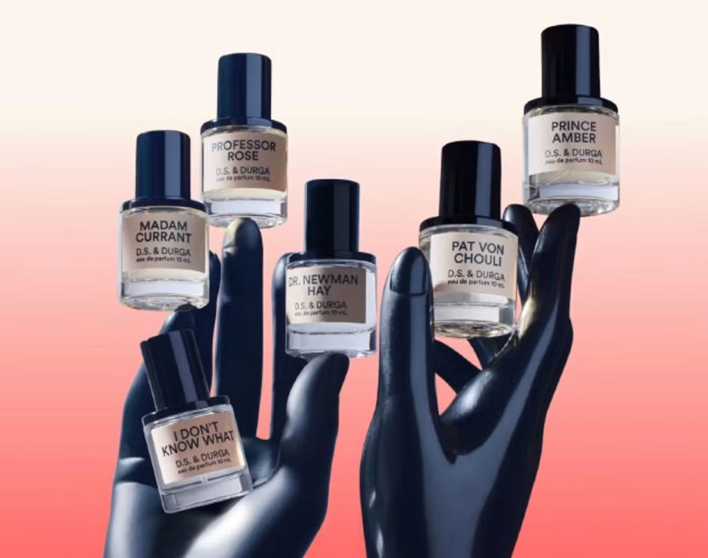
The premise is that someone has stolen the heart notes of I Don’t Know What, the brand’s transparent enhancer, and the suspects are lined up. Six 10 mL bottles for $275, each one a single raw material given a name and a biography. Pat Von Chouli is patchouli with a backstory. Dr. Newman Hay is new mown hay, and a squire rumoured to deal in stolen hearts.
What’s even cooler about it is the card folded into the box, which asks the customer to record a solution name, a perfumer, and the number of sprays of each suspect. It is a recipe log if you think about it.
Consider what that fixes. The real barrier to layering is not desire, it is that nobody knows where to begin and everyone is afraid of ruining an expensive bottle. Five clearly labelled single notes is a small enough set to work through systematically. A blank formula sheet gives the customer somewhere to record what worked, which means the second attempt improves on the first and the eventual full-size purchase is an informed one. A vague instruction has become a bounded task with rules, characters, a goal and a record. The campaign page states it in three lines and then, in larger type, tells the visitor they are the perfumer.
There is a quieter effect underneath. A scent someone mixed themselves and named on a card is worth more to them than one handed over finished, and it is very hard to return. The set won Most Innovative Fragrance at the Fragrance Foundation Awards, and the brand got there well before the trend did.
Everyone’s Doing Laundry Now
The first thing on dsanddurga.com right now is not a perfume. It is a laundry detergent, a limited collaboration with Guests on Earth in Big Sur After Rain, $60 for 750 mL.

Premium detergent has become one of the loudest categories in beauty this year. Marie Claire has been tracking the boom, with Stylus forecaster Lisa Payne describing it as the premiumization of beauty filtering down into everyday personal care, reinterpreting formats to turn a chore into a ritual. Body wash went first, then deodorant, then toothpaste, and detergent was always going to follow because it is the most scent-driven product in the house.
The interesting move is not that they made a detergent. It is what the detergent was made out of. Big Sur After Rain already existed across almost the entire catalogue, as a perfume at $225, a candle at $75, an auto fragrance at $18, hand soap, hand lotion and various pairings in between. The detergent is a new rung on a ladder that was already standing. The trend did not require a new idea, only a new format for a scent the brand had owned for years.
What the page proves is that the brand can hold two registers at once. The detergent gets the identical notes rail, liner note and playlist a $225 perfume gets, and then, without any change in tone, tells you how many pumps a heavily soiled load takes. Neither register embarrasses the other, and that works because the perfume copy was never treated as precious in the first place. A house that files its corporate gifting page under the heading Corporation Giftoration has already given itself permission to explain pump counts.

The Gift Card
Isn’t this the best gift card image you’ve ever seen? Enough with the plastic-like-ribbon-wrapped gift card images!

This one tells the truth, and then goes further by choosing the least dignified form money takes. That is what makes it work commercially rather than just tonally, because the real barrier to buying a gift card is that it feels lazy. The image and the line underneath it, that the heart wants what the heart wants, dismantle the objection together. Buying a $225 perfume for someone else is a bet placed on another person’s nose, and losing it leaves them with a bottle they will never wear. The card is not laziness. It is deference. The buyer gets to laugh at themselves for two seconds, and having laughed, no longer feels the need to apologise for the purchase.

Takeaways:
-
Find the sense your category is missing, then substitute for it deliberately. If customers can’t smell, taste, feel weight or hear your product before buying, pick a channel they do have and build something real in it. Treat is as a functional part of the page, not a garnish.
-
Work out what your utility pages are claiming. Gift card and account pages usually inherit a stock visual that pretends the product is something it is not. Name the awkward truth about the purchase and the buyer’s hesitation tends to go with it.
-
Move your strongest argument above the decision point. If the most persuasive content on your product page sits below the add-to-cart button, surface a summary or an expandable teaser before the customer has to commit.


