
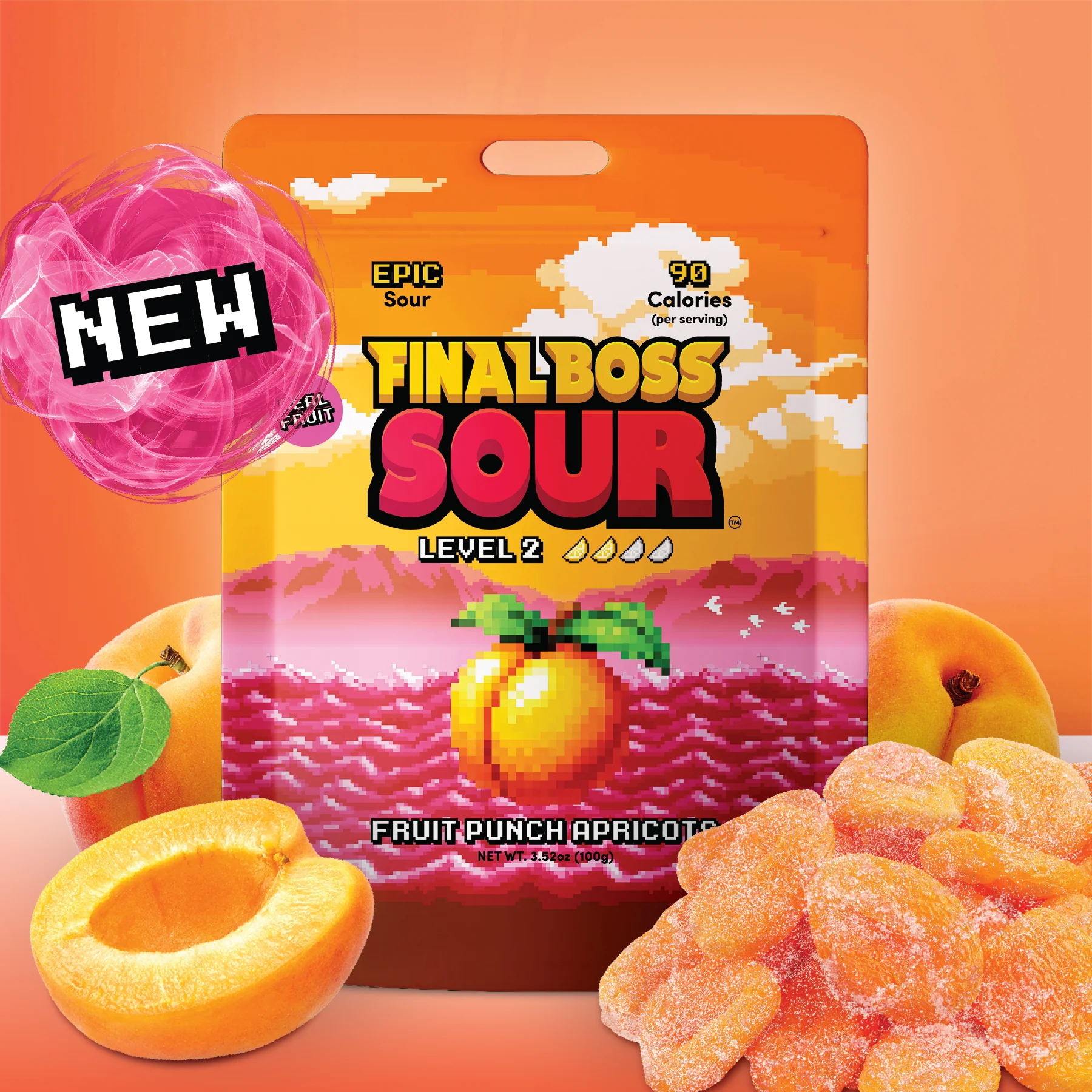
There’s a specific muscle memory that sour candy trains into people. Long before the taste, the face already knows what to do: eyes narrow, jaw tightens, cheeks pull back, like the body is bracing for an impact the tongue hasn’t confirmed yet. Most sour candy brands try to sell you the aftermath of that reaction, a photo of someone already deep in the wince, proof that the product works. Final Boss Sour sells you the anticipation instead. Its whole site is built to make that pre-emptive face happen while you’re still just scrolling, still just deciding, nothing near your mouth yet. That’s the trick worth naming before anything else: the sourness isn’t the payoff here. It’s the ambient tension running under every screen.
You feel it because the site never lets you arrive at a flavor cold. Every choice is staged as an escalation you’re opting into, not a menu you’re browsing. That’s the actual thesis of this brand, and it shows up as a structural decision, not a decorative one
The Level Is The Aisle

A sourness tier is normally a footnote, a chili icon stamped in the corner of a bag so the label does its one legal job. Final Boss Sour makes it the organizing principle of the entire store. You don’t shop by flavor family the way a normal candy site sorts things. You shop by how much you’re willing to take, currently up through Level 4, and the site tracks who’s already taken the most, publicly, in a running leaderboard of top buyers. That single design choice quietly reframes the purchase. You’re no longer choosing a taste. You’re choosing a threshold, in front of an audience.
A Final Boss tier, above Level 4, is on its way, which means the site isn’t just gamifying a static product line, it’s gamifying its own roadmap. The dare gets to keep escalating past whatever currently sits at the top, and the brand gets a built-in reason for people to come back and check where the line moved to.

The proof that this isn’t just a themed grid sits in the map – the gamification runs upstream of the catalog instead of downstream of it. Gooberland isn’t a mood illustration parked next to the shop, it’s an actual world-select screen, the kind you’d see between stages when playing Nintendo games, and there are several maps. That reframes every future flavor drop as unlocking a level rather than launching a SKU, and it means the roadmap itself becomes a reason to keep checking back, the same pull a game exerts when you know there’s a stage past the one you’ve cleared.
That’s a genuinely different psychological contract than “pick a flavor.” It converts a snack purchase into a small, low stakes dare, which is exactly the kind of thing a 20-something buys to post, not just to eat.
The Monthly Drop Club

The Monthly Drop Club is where that pull gets turned into a standing subscription instead of a hope. It isn’t sold as a candy-of-the-month convenience the way most snack subscriptions are. It’s sold as guaranteed access to flavors that don’t exist yet, “never-before-tasted concoctions,” with the commitment structured exactly like a season pass: pay monthly, or commit further out and pay less per drop while banking a free first shipment. That’s the map’s unfinished paths made purchasable. The site already taught you that there’s more game past what’s currently unlocked. The Drop Club is the mechanism that turns waiting for it into recurring revenue.
Arcade Look & Feel

I just LOVE Final Boss Sour’s deep commitment to the arcade look & feel: The colors, the pixelated elements, the characters, the “New” and other icons. The familiary 8-bit chunky typograhy, a blocky pixel font with a hard drop shadow shows up on section labels, on FAQ headers, on the fine print of a benefits list, places most brands would default back to their normal brand font because nobody’s paying attention there anyway. The level buttons carry it too, boxed in thick, doubled borders that read more like a game menu option than a standard ecommerce filter pill.
Then, on desktop, even the cursor gets reskinned. That’s the detail that actually proves the commitment, because a cursor is the single easiest piece of interface chrome to leave alone. Nobody would have noticed if it stayed a default arrow. Swapping it anyway means the retro-computer bit isn’t being applied to the site, it’s being applied to the entire act of using the site, down to the one element that exists purely to track where your own hand is. That’s the difference between building a theme and building an operating system.

That’s why a collab with Pacman isn’t just a collab. It’s a validation – the brand had already built every mechanic a Pac-Man collab needs before Pac-Man ever showed up: Levels, bosses, a dare structure. The license doesn’t introduce a new vocabulary, it just gets handed the keys to a world that was already speaking it. That’s the difference between borrowing credibility and cashing in credibility you’d already earned.
Nicolas Cage Sourness Level
A sourness scale illustrated entirely through Nicolas Cage getting progressively more destroyed on screen, ending on his most infamous bee related freakout, assumes you already know the reference and rewards you for getting there half a beat before the copy would. And this is when it gets odder – level 3 is NOT Nicolas Cage.

A brand positioning chart, the single most self-important slide in any competitive deck, gets undercut by tossing in two completely unrelated non-candy companies as a punchline nobody asked for. Neither joke is explained. Neither needed to be. That confidence, the refusal to caption its own humor, is doing more to signal who this brand is for than any stated audience line could.

The Checkout

I love it when a checkout page keeps the color blocking and the logo intact rather than defaulting to a bare template. It’s a small thing, but we all remember that these are the small details that make the big impact eventually.

This is also the first time I see a shipping protection platform with this kind of offer – not just the protection itself but other perks as well. I’m still not 100% sure about having the customer add more money, whatever the amount is, to protect an order they make online – but I get that this is the reality. So this offer is solving the real anxieties of buying a small, easily lost, easily damaged shipment online, cashback that rewards repeat purchase, protection against a lost box, an actual guarantee if the product disappoints.
Takeaways:
-
When a site builds real anticipation into its structure (an unfinished map, a roadmap with unrevealed levels), look for a way to let subscribers track their own progress against it. Turning a recurring charge into something that feels like continued participation is worth more than the charge alone.
-
If a brand voice is strong enough to survive the FAQ and the bullet lists, check whether it’s surviving the emails too. Shipping confirmations and subscription dispatch notes are easy to leave on autopilot, and they’re one of the few remaining moments a customer hears from a brand outside the site itself.
Dee2See by Lihi Lothan reviews DTC ecommerce experiences for brand managers and growth teams. We look at what happens between “I’m interested” and “I bought it.”


One response to “Why the Sour Face? Final Boss Sour Candy”
[…] has become a thing now – from Vacation’s 80’s total look to Final Boss Sour pixelated visual gaming language, there’s something about going back to naive times that comes as a countermove to the all AI, […]