There’s a moment on the Vacation.inc homepage where you notice a small illustrated man floating on a pool raft in the upper right corner of the screen. He’s just there, drifting, as the page loads around him. He’s not a navigation element. He’s not a CTA. He’s a vibe signal, and he’s telling you exactly what kind of brand you’re dealing with before you’ve read a single word of copy.
Vacation sells sunscreen. Broad spectrum, dermatologist tested, Hawaii Act 104 compliant. By every functional measure, they are in one of the most commoditized categories in personal care. The product itself, a cream that protects your skin from UV radiation, is chemically indistinguishable from what you’d find at a drugstore.
And yet.
The Vacation website is one of the most complete brand executions in DTC ecommerce, not because it breaks the rules of conversion design, but because it follows every single one of them while being completely, stubbornly, delightfully itself.
Welcome to the 80’s

Most DTC brands open their hero with the product. A clean shot, a claim, a CTA. The formula is so standard you could generate it from a template. Vacation® opens with footage instead, the specific washed-out grain of VHS beach footage from an era before anyone was thinking about SPF, and what that choice says before a single word loads is: we are not here to sell you sunscreen. We are here to take you somewhere.
The quotation marks around “The World’s Best-Smelling Sunscreen” are doing something clever. They’re simultaneously a claim and a wink. The brand is saying: this is what people call us, and we’ve decided to own it as our tagline. It’s self-aware without being ironic, confident without being arrogant, and it leads with scent rather than SPF because Vacation understood something that most sunscreen brands never figure out: the reason people resist sunscreen is not ignorance of sun damage. It’s that sunscreen smells like obligation. Vacation decided their product would smell like a memory instead.
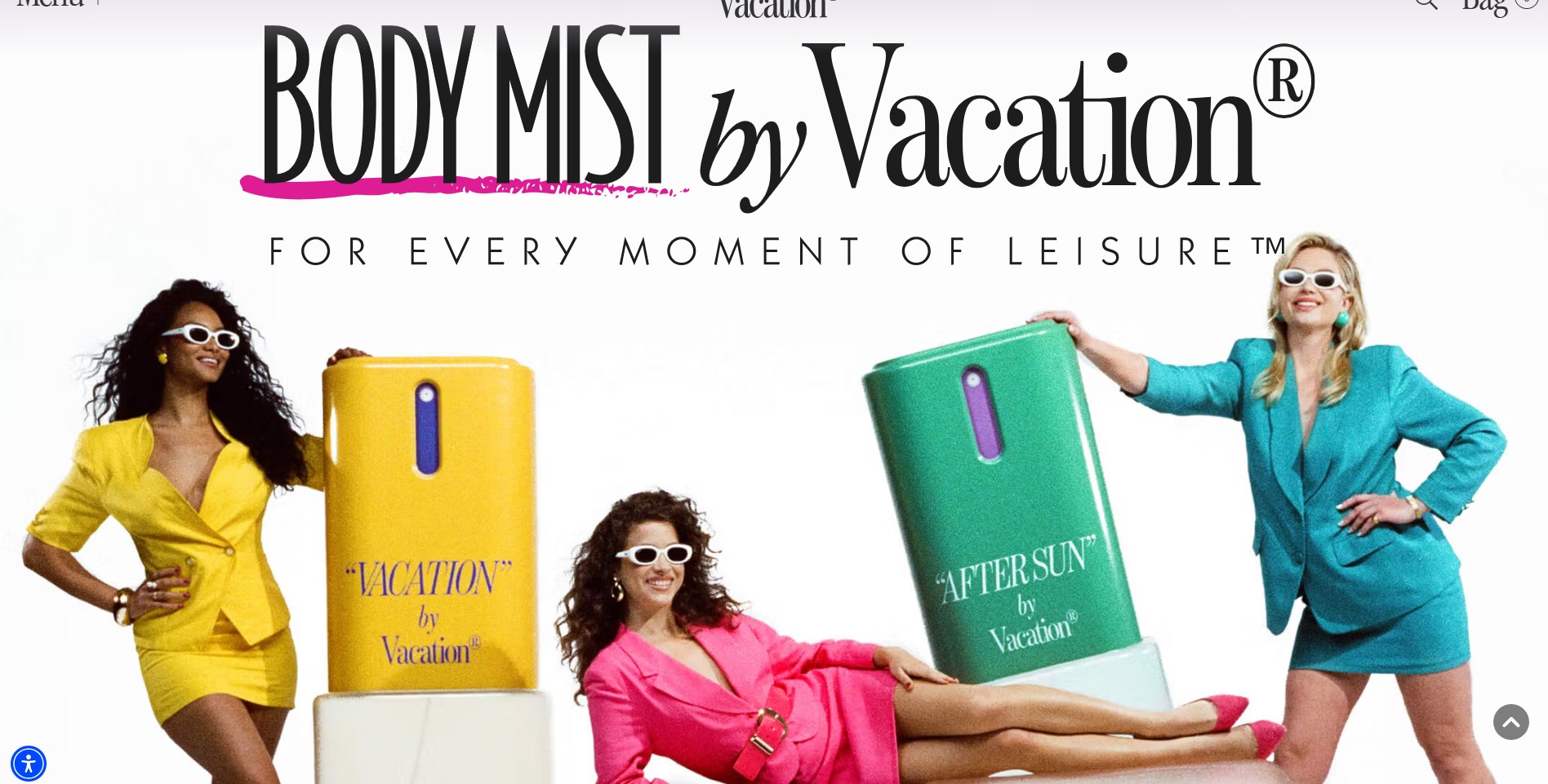
The Visual Language

There is a conversation happening in DTC marketing about AI-generated imagery, and it is almost entirely the wrong conversation. Vacation settles it without trying to.
What the images on this site demonstrate is not a technical achievement. They demonstrate a creative brief of unusual precision. Someone decided that every image needed to feel like it was taken by someone who happened to have a camera at a pool party in 1983, or shooting a commercial that decade. The specific quality of color that comes from 35mm film in high heat. The body language of people mid-conversation, not mid-pose. The facial expressions. The particular sun-blinded squint of someone turning toward a lens they weren’t expecting. The grainy background, models positions, specific art styling and effects. Getting any one of these details right is craft. Getting all of them right, consistently, across every frame on the site, is commitment to a visual language so complete that the question of whether a human photographer or a generative model produced it becomes genuinely irrelevant.
The brief was right. That is what makes it work. And a brief that precise and that committed produces authentic-feeling images regardless of the tool, because authenticity at this level is not a property of the camera. It is a property of the intention.
What’s even cleverer is the Vacation merch integrated into these images. As if the brand has actually been there since the 80’s.

Even the Contact Us page is brilliant. Take a look at the Financial Services imagery with the computers! You see, It’s beyond decortaion. It’s a commitment – the Vacation universe has no off switch. There is no screen on this site that the art director decided wasn’t worth the effort.


The art director’s decision to present press quote over a photograph of a model holding a brick phone is not a styling choice. It is a statement – a brick phone is not a prop you grab from a closet. It is a deliberate research decision. So is the teal divider bar that makes the carousel header look like the section strip from a 1980s printed catalog. Add the high-thigh bikini bottom and hairstyle. These details compound. Individually each one is a nice touch. Together they create the sensation of a brand that cares about every square inch of every screen, which is the sensation that makes people trust you before they have any rational reason to.
The testimonials section is labeled “Words of Wisdom from true Leisure Connoisseurs,” which reframes the customer review from a trust-building element into a membership signal. You are not reading reviews – youu are receiving wisdom from people who have attained leisure expertise. Add in the Vacation t-shirt merch, and you have a perfect, perfect visual.
The Typography

The typography plays a crucial part as in the visual identity – everything on the site looks like it could have appeared in a different 1980s commercial, and that is exactly the point. The logo script is the kind of handwriting you’d see on a surf shop sign in a Coppertone ad. GRAND CUVÉE gets elegant all-caps serif because it is the luxury SKU and luxury SKUs in the 1980s dressed like wine labels. The featured products list uses what looks like typewriter output, slightly uneven, slightly mechanical, because that is what a corporate memo looked like before desktop publishing.
None of this is arbitrary retro pastiche. It is period-accurate casting. Each typeface is the right voice for the specific artifact it is mimicking, and because every artifact is from the same era, the whole site coheres without ever being uniform. The result is a brand that feels like it has a history rather than a launch date, like flipping through a box of old magazines and finding the same name on every cover.
Doing the eCommerce Stuff, Vacation Style
Every ecommerce website has to have the basic elements for you to complete a purchase: you have to trust the brand, understand the product, add it to the cart. Vacation takes the entire customer journey, and does it in a way that no element is invisible.

Product features on the homepage: Vacation kept all the same information and changed only the container. Instead of an icon strip, they built what looks like a page from a 80’s commercial, and it’s so god damn wonderful you actually want to read everything – some of the visuals are also small, short videos, which makes them even more eye-catching.

Homepage Featured Collection: Not your usual product grid or carousel of rotating images. Absolute wow.


Every single element on the product page is exactly where Baymard Institute would tell you to put it. Star rating, price, a “What it is” description, accordions for Features, Benefits, and Key Ingredients, a quantity selector, an Add to Bag button, trust badges underneath. The information architecture is textbook. The execution is anything but.
We’ve already talked about the creative (you have to see the videos for each product. I wish I could embed them here but I can’t) and typographic languages, but take a look also on the ingredients list: Vacation refuses to let functional copy exist without an emotional layer running underneath it. The ingredient names read like a menu at somewhere you’d feel good about being seen: Multidimensional Rose Gold Shimmer, Argan, Jojoba, Peach & Chardonnay Grapeseed Oils. The Chardonnay is doing particular work there, because “grapeseed oil” would cover the formulation just fine, but Chardonnay makes the product feel like something you sip rather than apply, which is the association Vacation wants embedded in your memory when you reach for it poolside.

The discount and promotions section is called The Vacation® Clipper, complete with a scissors icon. The offers inside are formatted as newspaper clippings with dashed cut lines, printed in the visual language of 1980s mail-order catalogs. One clipping advertises the “Orange Gelée Revival Project” with a phone number printed large.
The information inside these clippings is completely standard – price, SKU, checkout instructions. But the framing makes you want to actually clip them, which is the point. When a discount code is delivered inside a format that feels like a found object rather than a promotional mechanic, the act of using it feels like participation rather than transaction.

Even the email capture popup is formatted as a physical coupon, complete with a barcode, a serial number, crop marks, and fine print that reads like an actual legal disclaimer from a sweepstakes entry in 1986.
The fine print is fiction. It is crafted to sound like the legal boilerplate on a vintage contest entry form, and it is funnier and more memorable than any headline a standard email popup could offer. This really makes you want to join their mailing list – and trust me, you won’t be disappointed. The fun and gorgeousness continue in your inbox.

The checkout is standard Shopify, but the background color of the order summary panel, is the same deep Vacation blue,rather than the standard Shopify white or grey. It’s a small detail that most brands miss entirely, and it matters because it signals that the brand didn’t abandon you at the point of highest friction.
The Business Card Section: Loyalty Program as Character Work

Most loyalty programs are transactional by design, no matter how you call them – Join Our Cirlce, Join the Club, Become and Insider. You see a list of benefits and features with icons, you sign up, agree to receive emails – and that’s that.. The value proposition is mathematical. Vacation looked at that mechanic and decided to make it absurd instead.
The honorary role system gives you a job title at Vacation Inc – not a tier name. A title, on a virtual business card, that you can shuffle until you find one you want. Manatee Diet Coordinator. Executive Bubble Bath Splasher. Head of Beachball Inflation Service. The SHUFFLE button is the detail that unlocks everything: it gives you a reason to stay on the page, to play, to laugh, to click again. Most email capture forms are designed to minimize time spent on them. This one is designed to maximize it, because the longer you spend shuffling titles, the more invested you become in the one you claim, and the more the brand has become something you participated in rather than something you signed up for.
The listed benefits sit somewhere between real and fiction with complete deadpan sincerity: staff only merch, preferential treatment at Poolsuite FM events, and then, at the same indentation level as the actual perks, “career boosting title for your LinkedIn” and “impressive eggshell (virtual) business card with Garamond typeface.” The joke only works because the delivery is completely straight. Vacation never winks at you directly. They trust you to get it, which is itself a form of flattery, and flattery, it turns out, converts.
Poolsuite FM Radio

Poolsuite FM, the radio station accessible via QR code on the packaging, appears in this section at the same visual weight as the dermatologist certification. Most brands who partner with a music platform treat it as a marketing add-on. For Vacation, the relationship runs considerably deeper than that. Poolsuite FM, originally launched as Poolside.fm in 2014 by Marty Bell, a Scotsman building a virtual escape from the rain, was the community that Vacation was born out of. Bell is one of Vacation’s co-founders. The radio station did not come to the brand as a collaboration. The brand came to the radio station as its next chapter. Which means that when Vacation places Poolsuite FM alongside “Dermatologist Tested” as a product feature, they are not saying the radio station is as important as the SPF protection. They are saying the feeling of being on vacation is as important as the SPF protection. And they have an entire decade of community-building behind them to prove it.
The Vibe Generator

Somewhere on the site, there is a tool called the Vibe Generator. It presents four audio sliders: Ocean Breeze, Steel Drums, Tropical Birds, Beach Bar. You mix them to your preferred ratio and it plays a custom ambient soundscape.
This does not help you buy sunscreen. It does not explain SPF levels or compare formulas. It has no conversion function whatsoever. And it is one of the most memorable things on the entire site precisely because it has no conversion function whatsoever. It exists to let you spend five minutes adjusting how much Beach Bar versus Steel Drums you want in your afternoon, and when you finally put your headphones down and go back to the product page, you are already on vacation in your head. The product you’re about to buy will keep you there.
This is what “brand experience as conversion mechanism” actually looks like in practice. Not a quiz. Not a personalization engine. A soundscape mixer that makes you feel something before you buy anything.
A Brand That Speaks To Every Sense
We’ve discussed the visual aspect – The palette, the typography, the VHS footage, the period-accurate casting in every photograph. All of it is doing visual work at a level of precision that this review has spent considerable time documenting. But the visual is only the beginning.
Smell is the second sense, and Vacation addressed it before they addressed almost anything else. “The World’s Best-Smelling Sunscreen” is not a tagline. It is an announcement of intent. The product description for their signature Classic Whip reads like a perfumer’s brief: coconut, banana, pool water, pool toy, swimsuit fabric. These are not ingredients. They are olfactory memories, and by naming them in the copy, Vacation makes you smell the product before you’ve ordered it, before it’s arrived, possibly before you’ve decided to buy it. The copy completes what the visual starts. You see the footage of the pool, and you smell the sunscreen, and you are already there.
Touch comes through in every packaging decision. “Classic WHIP” in a red aerosol canister. “Grand Cuvée Shimmer Oil” in a glass bottle with a ribbed gold cap. The Orange Gelée in a squeeze tube with a tactile printed label. These are objects that communicate weight and texture and the specific pleasure of holding something well-made before you’ve ever touched them, because the art direction made you imagine the grip. That is a difficult thing to achieve on a screen and Vacation achieves it consistently.
Then Poolsuite FM opens, and the Vibe Generator is there waiting for you, and the picture closes.
What Vacation understood is that the auditory layer is not an add-on. It is the final sense in a sequence that was always building toward it. You cannot smell through a screen or feel the weight of a bottle in your palm, but you can get close enough that when the music starts, every other sense that the site has been carefully priming clicks into place. The sound does not create the feeling. It completes it.
The conventional wisdom in ecommerce is that brand personality is a top-of-funnel concern. You build awareness with personality, then you convert with clarity. Strip away the fun at checkout. Make the PDP clean and clinical. Let the product speak for itself.
Vacation runs a controlled experiment against this hypothesis on every page of their website, and their results suggest the conventional wisdom is wrong, or at least incomplete. The personality is not layered on top of the conversion architecture. It is the conversion architecture. The Vibe Generator is a retention tool. The Vacation Clipper is a promotions engine. The business card enrollment is a loyalty program. Every element that appears to be pure brand expression is also performing a commercial function, and every commercial function is being performed inside the world.
The question Vacation forces every DTC brand manager to ask is not “how much personality can we inject before it hurts conversion?” The question is: what would it look like if the personality and the conversion were the same thing?

Takeaways:
-
Audit your checkout for brand abandonment. Pull up your checkout flow and look at the order summary panel. Is it your brand color or Shopify grey? Is the font yours or the platform default? The checkout is the highest-stakes screen on your site, and most brands dress it in the platform’s clothes instead of their own. Pick one brand element, a color, a font, a phrase, and make sure it survives all the way to the confirmation page.
-
Find your radio station. Not literally. But ask: what is the one completely unnecessary thing your brand could offer that would make people remember you? Vacation has Poolsuite FM. Last Crumb has a three-day baking narrative. The Farmer’s Dog has a party hat illustration. These features have no direct conversion value and enormous indirect conversion value because they create the kind of memory that makes people tell other people. If everything on your site is functional, you’re missing the feature that gets you shared.
-
Rename one commercial mechanic. Your discount section is “Promotions.” Your loyalty program is “Rewards.” Your email popup is “Sign up for 10% off.” Vacation renamed all of these: The Vacation Clipper, the honorary role system, a coupon that reads like a 1987 sweepstakes entry. The underlying commercial mechanic is identical. The experience of encountering it is completely different. Pick one, give it a name that belongs to your world, and see what happens to engagement.
-
Let your world hold at every touchpoint. The business card is blue. The clipper section is newspaper. The contact page has a mainframe in swimsuits. The checkout panel is brand blue. The world Vacation built does not dissolve when you navigate from the fun parts to the functional parts, without harming their usability or functionality. Map every screen on your site and ask: where does our world stop? That’s where customers feel the brand end and the transaction begin, and that’s the gap worth closing.
Dee2See reviews DTC ecommerce experiences for brand managers and growth teams. We look at what happens between “I’m interested” and “I bought it.”

