The olive oil aisle has a trust problem.
Not a quality problem. A communication problem. Walk into any grocery store and the shelves are lined with dark glass bottles wearing Tuscan color palettes and italic fonts that gesture vaguely at Mediterranean heritage. The labels say “extra virgin.” They say “cold pressed.” They say “imported.” What they don’t say is that most of what’s inside was blended from old oils sourced from multiple countries, bottled long after harvest, and dressed up in the visual language of a category that stopped earning that language decades ago.
Graza looked at this and decided the problem wasn’t the oil. It was everything around the oil.
Drizzle. Sizzle. Frizzle.
Most olive oil brands sell one product and explain the use cases in a paragraph buried in the FAQ. Graza sells three products and names them so clearly that the use case is inside the name.
Drizzle is the finishing oil. Sizzle is the everyday cooking oil. Frizzle is the high heat oil. You do not need to read the description to understand the product. Put aside the fact that I imagine these as three Disney characters, I even love more the fact that you already know what each one is for the moment you hear it, which means the entire cognitive burden of the category decision has been resolved before you’ve clicked on anything.

The product descriptions mirror this directness. Drizzle is “made for eating, never heating.” Sizzle is “use it every day, in every way.” Frizzle is “your new high heat kitchen hero.”
The oils actually are different, harvested from the same olive at different points in the season, which changes the flavor profile and the appropriate use. And Graza explains this difference in a way that makes you feel like you learned something rather than read a spec sheet. That specificity is only possible when the people writing the copy actually know what they are talking about. You cannot fake the detail about 24 pounds of October olives yielding one liter of Drizzle. You either know it or you don’t.
Scrolly-Telling
Graze uses space as pacing – the scrolling and emptiness are used in the way a good comedian uses silence, to let the previous line land before the next one arrives.
On the homepage scrolling, the drop element scrolls down with you –


The same technique is used for explaining the difference between Drizzle and Sizzle, where an olive element scrolls down with you –


And the content is SO great and surprising and educating, you just want to keep on scrolling to see more.
Most ecommerce sites treat scrolling as something to minimize. Get the user to the add-to-cart button as fast as possible. Graza treats scrolling as time they have been given and intend to use well, resulting as a site that feels longer than it is and shorter than you want it to be.
The Photography
The Graza website does not look like a food brand’s Instagram account. It looks like someone who loves cooking actually took these photographs.
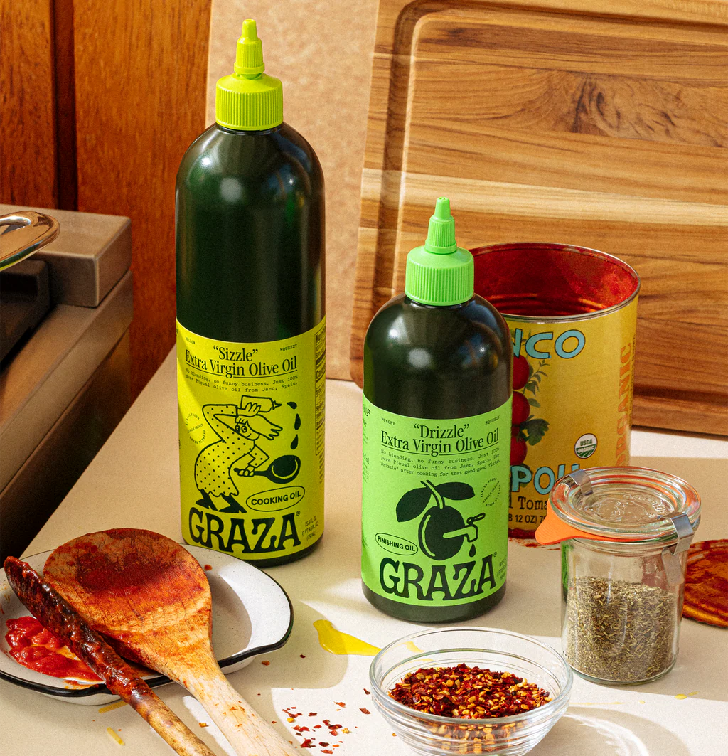
The colors are bold and deliberate – the wonderful lime green against dark forest green’s brand colors. A red cardigan against a concrete countertop. The vivid yellow-gold of oil streaming from a squeeze bottle into a white dish on pale marble. These are not the muted earth tones and linen textures that premium food brands reach for when they want to signal restraint and good taste. Graza’s palette is the palette of a kitchen that is actually in use, where the tomato sauce has already splattered.

Some of the scenes are not tidy. This is not an accident – they’re specific, real, and confident enough to show the mess because the mess is where olive oil actually lives.They are not trying to make olive oil look aspirational. They are trying to make it look useful, which turns out to be more appealing than aspirational, because useful is something you can actually picture yourself doing.

Illustrations As A Second Language

Running alongside the photography, through the product pages, the homepage, the education sections, and the packaging itself, is a second visual system that does entirely different work.
The Graza illustration style is hand-drawn, loose, and deliberately imperfect. These illustrations are not decoration, they are part of the brand’s personality and a translation system – every time the site needs to explain something that would otherwise require a paragraph of technical copy, an illustration (sometimes in an animated gif format) steps in and does it in a single image.

The style is consistent enough to function as a brand language but loose enough to feel human. This is a deliberate calibration. A tighter, more polished illustration style would push the brand toward the premium, slightly precious register that Graza is specifically working against. The looseness signals the same thing the messy kitchen counter signals: we are not precious about this. We just love it.
What makes the illustration system genuinely smart is that it appears on the packaging too. The character on the Sizzle label is the same visual family as the characters in the product page diagrams, which are the same family as the fun fact illustrations on the homepage. The brand does not change register when you move from the site to the bottle in your hand. The world is consistent all the way through, which is the hardest thing to achieve and the thing customers feel most deeply without ever being able to name it.
The Copywriting
The Graza voice sounds like someone who knows a great deal about olive oil, finds that knowledge genuinely delightful, and sees no reason why you should not feel the same way.
We saw it in the product names first, but it’s throughout the site, showing up in the small moments that nobody asked for and everyone remembers. “Just like (most) humans, olives get more chill with age.” The parenthetical is the whole joke. Remove it and the line is a fact. Keep it and the line is a personality. “Vegetable oil doesn’t come from vegetables. Sneaky!”

The exclamation point is not enthusiasm. It is the sound of someone who has known this for years and still finds it worth sharing.
It shows up in how objections are handled. The Sizzle product page opens with a tab that reads: “Before you say EVOO isn’t for cooking, read this.” The objection is not buried in a FAQ. It is the entry point. Most brands ignore skepticism or route around it. Graza names it in the tab title and answers it in the first sentence, which is the copywriting equivalent of opening a conversation by saying the thing everyone is already thinking. Once you do that, the reader stops defending and starts listening.

It shows up in how the brand talks about the competition without naming them. “Major olive oil brands save money by blending low-quality, old oils from all over the globe while slapping a country name on the label. That’s shady!” The word “shady” in a product description is a choice that most brand managers would walk back in the first review. Graza left it in because it is true and because the brand has decided that being true is more important than being careful.
Education As a Product
By the time you reach the product page, Graza has already told you a great deal about olive oil without you noticing it was happening. The illustrations explained the harvest. The scroll gave you room to absorb each idea before the next one arrived. The photography showed you a kitchen where the oil was already in use.
The product page makes the education explicit.
The fun facts section delivers single observations in generous space. Each one lands, breathes, and moves on. None of them are necessary for the purchase. All of them change what the purchase feels like. By the time you have read a few, you are no longer shopping. You are learning from someone who finds this genuinely fascinating and wants you to as well.
The product pages go deeper, using diagrams and illustrated characters to explain differences that a spec sheet would make boring and a paragraph would make tedious. The copy does the same. It has the specific quality of writing that only exists when the person behind it actually knows the subject and actually loves it. You cannot fake that register. You either care about olive oil enough to write a parenthetical that makes someone laugh, or you don’t.
That assumption is the entire Graza strategy – teach people something real. Trust them to find it interesting. Let the interest do the selling.
Yes We Can
All of these insights above are demonstrated beautifully on the new refills section:
Nobody ships olive oil in aluminum cans – beer, yes. Sparkling water, yes. Canned fish, obviously. But olive oil has always been glass or plastic, because that is what olive oil has always been. Graza looked at that and saw a sustainability problem, a freshness problem, and a repurchase problem all waiting to be solved with the same object.

The refill can is nitrogen-sealed, which keeps the oil fresh until the moment you open it. It is portioned for a single refill into the squeeze bottle, which means no awkward pouring from a large vessel, no spillage, no guesswork. And it is aluminum, which means it goes straight into the recycling bin when you are done. The same recycling bin that holds your beer cans. Which is exactly the point.


There is something quietly radical about an olive oil that looks at home next to a six-pack. The category has always dressed itself in the visual language of provenance and age, dark glass, cork stoppers, labels printed in italics that suggest centuries of Mediterranean tradition. The can opts out of all of that entirely. It is modern, it is practical, and it is branded with the same illustrated characters and lime green palette as everything else in the Graza universe, which means it does not look like a compromise. It looks like a product someone designed on purpose.
The photography on the site confirms this. That recycling bin image is doing something unusual: it is showing you the end of the product’s life and making it look satisfying. The cans are empty. The bin is full. Someone has been cooking – and recycling will take place.
Most brands would never show you the recycling bin. Graza shoots it like a hero product image. Because the full recycling bin is the proof that someone actually used the oil, kept using it, and will order more. Which is the whole argument.

Copywriting is a masterpiece also on this section – “Get ready to glug” is doing something that most instruction copy never attempts. It makes the action itself something to look forward to. Most how-to copy is written to be invisible, to get the user through a process as quickly and frictionlessly as possible. This copy wants you to slow down and enjoy step two. The asterisks around “hissss” make you listen for something. “Glug” makes you anticipate the pour. By the time you have read the instructions, you are not dreading the refill. You are looking forward to it.

Trust As A Conversion Mechanism

Graza sells the same oil in different vessels: A squeeze bottle, a glass bottle, an aluminum refill can and a spray bottle.
Most brands would pick one and build a story around it. Graza offers all because each one is the right answer for a different customer in a different kitchen moment. Offering all four is how you signal that you actually thought about the customer’s kitchen rather than the category’s conventions.
And you believe them. Because everything else on the site suggests that these are people who have spent serious time thinking about olive oil, not as a business category, but as something they genuinely love. The kind of people who know that Picual trees can live for over a thousand years and decided that was worth putting on the homepage. Who know the difference between October olives and November olives and built an entire product split around it. Who know that most bottles labeled “extra virgin” are not the real deal, and said so, plainly, on the product page. The formats are the proof of that knowledge made physical.

This is why, when you see this photo above, you are not startled. Olive oil on a cake? Yes.
On paper, this should not work. But by the time you encounter it in the Graza flow, it lands differently. It lands as an invitation from someone you have decided to trust.
This is what the education section is actually building. Not knowledge. Trust. By the time Graza suggests the cake, you have learned about harvest seasons and polyphenol content and why vegetable oil is misleadingly named and how the squeeze bottle protects the oil from light. You have been taught things that are true and specific and useful, by people who clearly find all of it genuinely interesting rather than commercially convenient. You have laughed at a parenthetical. You have read copy that treated you like an adult who could handle complexity and humor in the same sentence.
That trust is the conversion mechanism. The cake works not because Graza proved olive oil belongs on dessert, but because they spent the entire site proving they know what they are talking about, and more than that, that they love what they are talking about. When someone who loves something tells you to try it in an unexpected way, you try it. Because love, unlike expertise, is contagious.
Takeaways
-
Let your instructions be worth reading. Most instruction copy is written to disappear. It exists to move the user through a process and get out of the way. Graza’s refill instructions made someone want to crack open a can. Find one set of instructions on your site, the returns process, the assembly steps, the care guide, and rewrite it as if a person who loves the product wrote it for a friend who is about to use it for the first time.
-
Show the mess. The Graza kitchen counter has sauce on the spoon and sardine tins in the background. The recycling bin is full of crushed cans. The cutting board has a lemon and a head of lettuce waiting to be used. None of this was accidental and none of it was cleaned up before the photograph was taken. Confidence in your product means being willing to show it in the context where it actually lives, not the context where it looks best.
-
Teach something nobody asked to learn. Find the fact about your product, your process, or your category that most people do not know and that genuinely surprises you every time you think about it. Then put it somewhere on your site with enough space around it that it can land properly. Not in a FAQ. Not in an accordion. Somewhere it breathes. Graza put theirs on the homepage and called them fun facts, which is the most honest possible name for information that exists purely because someone found it delightful and assumed you would too.
-
Find the objection in your tab title. Somewhere on your product page there is a concern your customer has that you are currently pretending does not exist. The question they type into Google before they buy. The reason they close the tab and think about it. Put it in the copy, name it directly, and answer it in the first sentence. Graza put “Before you say EVOO isn’t for cooking” in the tab title. The objection became the entry point.
Dee2See reviews DTC ecommerce experiences for brand managers and growth teams. We look at what happens between “I’m interested” and “I bought it.”

