
My day started with this irritating feeling, which grew by the click. Let me explain: I’m working hard to find brands and websites to post about. And it gets harder and harder. I reviewed over 180 websites today, and I’m like that kid who yelled “The Emperor has no clothes!” as I was scanning more product pages, homepages or anything that will ignite any feeling or emotion or something for crying out loud. EVERYTHING looks THE SAME. And this Sea of Sameness is becoming worse, as the current trend appears to be smaller fonts on the product pages, same photo sets. It seems like these entrepreneurs forgot that there are actual people on the other side of the screen, and if your brand looks and talks like any other brand in your category, well, you have a problem. Everyone who’s doing Functional drinks or anti-bloating solutions – you are all the same. No new customer will be able to tell your website apart from your competitors. This was really such a sad experience, that almost got me to say “F*uck It” and close all tabs. But then I got to Moody Incense website and the smile came back.
Moody Incense website proves that you don’t need big productions, huge budget or sophisticated prompts to create a shopping experience which is full of fun and delight. You just need to remember these three words: People Before Pixels. Make this your Mantra from now on. And I promise you, I’ll be nagging about this.
“Where’s Waldo” Experience
Moody doesn’t have too many products, but it has a Big Personality Energy. You can actually feel it. This is the kind of personality who is witty, fun and funny, and generous. You want to be its friend, and you want to be around it more. So you click and click, and the more you do – you prove yourself right, because almost every page on this website has something that catches your eye or mind. To be honest, I personally hate the smell of incense, but by now I feel confident and curious enough to purchase Moody’s.

Each of the products gets its own treatment on the product page, from the humor in the names themselves, to the “when to burn” or the small details in the images, to the “Have a Moody day” area. And you get a sticker sheet and a pin for gifts, which is also so much fun! And as you can see – this is a simple Shopify template. It’s really about knowing how to make it a platform and not a restrictions list.

The attention to details is something which we will see more of in a minute, but first take a look at the photography on the Bang On Incense, which backs up the joke instead of just decorating it. Not sure if it’s a rose quartz crystal or a toy, but the cassette case on the top is what caught my attention and I actually googled this – labeled The Entertainer, it’s an actual cassette from the 70s or 80s when Reader’s Digest routinely partnered with major record labels like Columbia and RCA to package multi-tape compilation box sets. So it’s not just a prop built to look vintage, it’s the real deal and you can almost FEEL the atmosphere, SMELL the aroma, FEEL the sensation of the fabrics and HEAR Barry White’s deep voice playing in the background.

Who hasn’t doodled this S symbol while high or daydreaming? The attention to details here is also in the color of the specific blue color of the pen, which creates a full palette alongside the purple background and flowers, dark blue of the blueberries, the yellow pen and the gold wrap of the opened chocolate bar.

The fun continues with the pouch product page where six badges are illustrated, with no hierarchy separating the substantive claims from the purely delightful one, so a sourcing credential and a sticker sheet get to stand as equals – but who cares? They are all done so wonderfully I’m sure the customer doesn’t mind reading the texts instead of just scanning repeating icons they have seen on 200 other sites.
The Night Stand

For each moody product, there’s an illustration that comes with it and that’s when I fell even deeper in love. You HAVE to look at the full size on their website. All of the illustrations are full of small and will-make-you-smile details, from the 4:20 on the clock to the “Time isn’t real” on the calendar, the vibrator and the swear jar on the night stand for the Relaxo Mucho product (I have to know what or who DLP stands for on this character’s tattoo).

Or this one for Bang On which has Nigella and Stanley Tucci’s cookbooks, the disco ball, the way the letters spell “picante” on the bottles and cans or even the rainbow icon on the guy’s socks.
And It Goes On

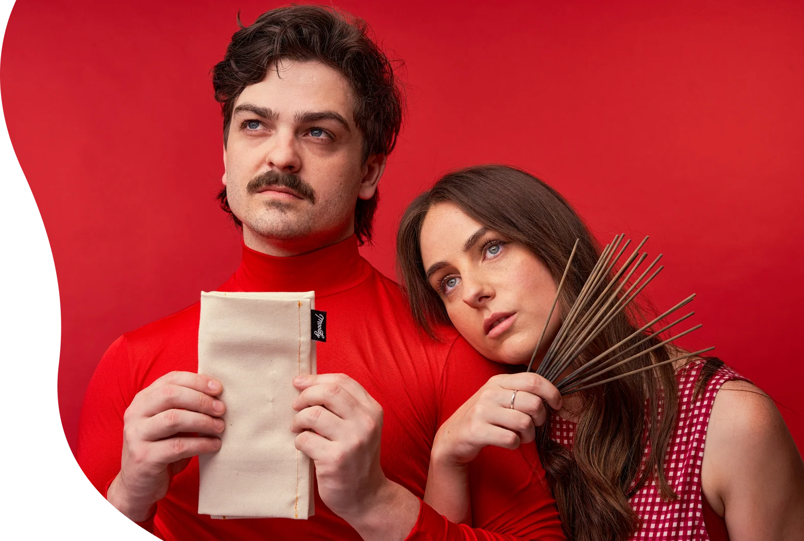
Everywhere you look, there’s something – a joke, a cute detail, a take on something. Take a look at this photo of the founders (I LOVE you!) – Louise holds a banana to her ear like a phone (it’s a banana phone!). Tayla holds an orange, completely straight faced, unimpressed by the whole exercise. Neither of them is doing the warm, approachable-half-smile-arms-crossed-or-chin-rested-on-palm founder headshots which we all know. Everyone else’s About page is trying to look friendly. This one is trying to be funny, which is a much smaller club.

I won’t reveal the content of the What’s the meaning of life question here on the FAQ section. Please go on and check it yourself, as well as the 404 page (click subscriptions at the footer) – let’s just say it’s beautifully NSFW.


Or the reviews strip at the very bottom of the page, which are hilarious and surprising.
It all feels like good friends came up with this brand and they love it, putting their hearts, minds, humor and secret little jokes into this website – and this, my friends, is how trust and loyalty are built. It doesn’t have to be around humor. It just has to be human.
I had to go and check the credits for this website, and this is when I realized that the founders are also credited for the website – and Louise actually has an eCommerce brand and positioning company on which I have found gems which I will probably review soon (OMG! you created Frank Body which I’ve admired for ages?!?!), as well as the following text regarding her approach:

You can read it here as well. This, my friends, is what I’m talking about. This is why this blog even exists. For people like Louise and Tayla, and studios like View-Source, that show true passion about what they do, deliver it beautifully and put People Before Pixels.
Takeaways:
-
Find the three or four words your product already owns, a ritual, a material, a verb customers already use when they talk about it, and write down every place on your site currently using a generic synonym instead. Swap them out one at a time, starting with your rating widget and your quiz or size finder copy, the two spots brand voice tends to opt out of first.
-
Hide your best line inside a real list, not next to one. A joke sitting in its own banner gets read once and skipped forever after. The same joke formatted exactly like the boring FAQ entry above it gets read twice, because nobody’s expecting it there.
-
Give your About page the same job as a product page. If your founders already talk about the product in terms of ritual or mood, structure their bios around those same categories instead of the standard meet the team grid. It turns a page people skip into one more reason to stick around.
Dee2See by Lihi Lothan reviews DTC ecommerce experiences for brand managers and growth teams. We look at what happens between “I’m interested” and “I bought it.”