
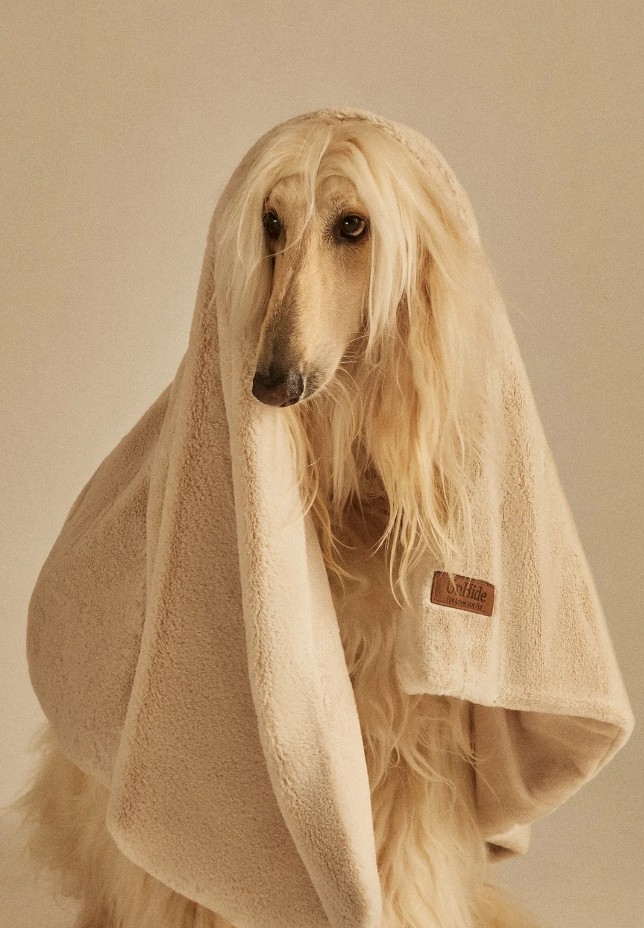
UnHide‘s product page features everything an AI shopping agent requires: over a million customers tag, more than 8,500 five-star reviews under every headline, an Us-vs.-Them comparison table, a sold counter in the cart, size charts, financing, a 45-day return window sitting right above the checkout button.
But what makes Unhide’s website so unique is that despite checking every one of those boxes, it never once forgets there’s a specific human on the other end of the click, someone looking for the softest possible thing to wrap around themselves, their new baby, or their dog. It’s the People Before Pixels kind of approach that I just love – the checklist and the heart are running at the same time, and neither one is doing the other any favors.
Nearly every photograph on an UnHide product page is doing one of three jobs that AI agents CANNOT understand: most exist purely to answer the question what does this actually feel like? Others exist to answer a close second: what size is this on an actual body, not just on a ruler. And a third, quieter kind exists to answer who this is actually for, by dropping the product into the exact scene or the exact life it’s meant for instead of describing it.

Soft AF (The What)

Some of the product pages have a “Soft AF,” section, paired with a zoomed in video of the sherpa close enough to count individual fibers. Scroll any product page and you’ll find the same instinct at work, at least one shot that exists purely to answer that first question: what does this actually feel like. The knit blanket gets the same treatment, a macro shot tight enough to see the twist in each stitch. The faux fur gets photographed mid fold so the texture catches light from three different angles in a single frame.


How Big Is It? (the How)
Second question: what size is this on an actual body, not just on a ruler. Blanket dimensions are a math problem until they’re on a person, and UnHide seems to understand that most customers do that math badly. Their size guide for the Marshmallow blanket doesn’t just list 50×70, 60×80, 80×108. It shows the same person, mostly hidden underneath the blanket, holding up each size so you can watch how much floor space and lap space it actually swallows.

The Shleepy size guide goes even further: five real models, from a kid to a plus size adult, each wearing the coat, with height, bust, and sleeve length labeled underneath every one of them. Nobody has to guess whether Medium means Medium on them specifically, or improvise with a tape measure.

It’s such an obvious idea for anything meant to drape over a body that it’s strange how few sites bother. Most blanket brands treat the size chart as a legal formality bolted onto the bottom of the page. UnHide treats it as part of the actual pitch.
It’s a Wrap (the Who & Where)
UnHide answers the who is it for question by casting, not describing. A younger, TikTok-native crowd gets a fuzzy cardigan, tousled hair, a game controller, an older stylish woman, or family with kids in various ages. Pets get cast with just as much care, with different breeds. Almost every scene plays out indoors, a nursery chair, a couch, a bedroom, which tracks for a product built around staying in.


Nowhere does the site push this further than the Backseat Pillow’s product page. Its own copy says the pillow is perfect for new moms too, and that line could have stayed a line. Instead the page shows two kids sprawled across a bed reading a picture book against the same pillow, then a completely different scene: the pillow tucked into an armchair beside a teddy bear and a baby bottle, in the exact kind of chair a person nursing a newborn at 3AM would recognize on sight. Nobody wrote “great for new parents” under that second photo. They didn’t have to.


Greige Goose Energy
I’ve always wanted to be a member of nail polishes and home paints naming team. To come up with cool color names AND get paid for that? amazing. Somewhere at UnHide HQ there’s a person whose job includes greys and beiges. And so, here are Greige Goose, Mocha Shar Pei, Taupe Ducky, Chocolate Hare, Burgundy Beau and Peony Pup. These read like names a friend would text you, not names a merchandising spreadsheet usually survives.

It would be easy to wave this off as a cute swatch, the kind of detail that dies the moment someone in a planning meeting asks whether it’s worth the extra line of copy per SKU. But it’s exactly the decision that separates a product catalog from a product world. Once a color has a personality, choosing between two nearly identical shades of beige stops being a chore and starts being a small, low stakes act of self expression. That’s a genuinely good trick to pull off with a blanket.
The attention to detail carries into the least glamorous corner of any product page: the icons. A blanket product’s icons indicate Machine Washable, Weighted Blanket and a coffee cup for Extra Cozy. Another product’s icons indicate it fits all seasons. No Claude or default icons anywhere.


While human products get the familiar line dry icon, the pet products swaps swaps it with a paw print, labeled “For best results, wash alone.” It’s a tiny edit and an easy one to skip, which is exactly why it’s worth noticing when a brand doesn’t.

I love you, fur real
UnHide’s pet products get the same production values as everything else on the site: a small terrier photographed mid golden hour on a grey donut bed, a whippet curled into a leopard print one in front of a real window with real houseplants, not a stock backdrop. The Floof bed’s review quotes the brand’s own Chief Bark Officer: “I’ve tried a lot of beds. And after years of testing and snoozing, I can confidently say that the Floof gives me the best naps, paws down.” It’s a joke, but it’s built with the exact same format and confidence as the review carousel on every human product page. Just a different species doing the endorsing.


UnHide even sells a Human plus Dog bed, a single cushion big enough for both species to nap on, which really proves that pets aren’t an accessory category bolted onto the real business here. They get the same size logic, the same review infrastructure, the same care in the photography. If a comfort brand’s whole premise is comfort for whoever needs it, this is what actually meaning that looks like.
Tag It
None of this warmth comes at the expense of the boring mechanics that move a customer from browsing to buying, it just gets folded into all of them. Start with the small pill shaped tag sitting above almost every product title in the grid. It looks like one element doing one job, but watch it across a few products and it’s actually doing three or four different jobs from the same UI slot. On the Marshmallow Blanket it reads “Our bestseller,” a status flag, proof by popularity. On the Cuddle Puddle it reads “Perfect for Sharing,” which isn’t a status claim at all, it’s an explanation of exactly which situation this specific blanket solves. On the Lil’ Marsh Blanket it’s “Great gift,” pure marketing, nudging toward an occasion rather than a use case.

The Shleepy gets “A wearable blanket,” doing double duty, explaining the shape while keeping it out of novelty gift territory. The “As Seen On TikTok” badge from a few scrolls back is a variation on the same idea, credibility borrowed from a platform UnHide doesn’t control, and it only shows up on the pieces that have actually earned it, not stamped across the whole catalog. Most sites use this badge slot for one job, always the same word, always a bestseller flag. UnHide uses it to answer several completely different customer questions and never makes the customer work out which one they’re reading.

The cart drawer keeps the same instinct running. It uses a free shipping progress bar like everyone else’s, except the copy underneath it rotates: “Oooo that looks soft…” and “You’re one click closer to cozy paradise!”. Scroll to the bottom of that same drawer and you get the full trust stack in three lines: 45 day returns, over 8,500 five star reviews, one million blankets sold.

Every one of those elements exists because it converts. None of them read like a conversion tactic while you’re looking at them, because the brand voice never once drops out to deliver them. Even checkout is still talking like the rest of the site talks. That consistency is the real difference between a site that follows best practices and a site that has a personality which happens to also follow best practices.
Unhide & Chill
UnHide’s Netflix collection opens with a plain enough pitch, something about movies, popcorn, and blankets belonging together. There’s the blanket, and there’s the Binger, a blanket built to unfold into a poncho, named for the exact behavior it exists to support. The product description doesn’t dress up the idea either, it sells the Binger as the fix for getting up mid episode without losing your blanket on the walk to the kitchen. This is a co-branded product actually built around a specific human problem, not a logo stuck onto an existing one.


That’s worth separating from the rest of UnHide’s trust signals. Most brand partnerships work by borrowing someone else’s credibility and hoping it rubs off. This one works because the product earns the crossover on its own merits, a blanket poncho for people who refuse to pause the show is a genuinely on-brand idea for a streaming platform, not just a badge on packaging.
Takeaways:
-
Photograph the caption, not just the product. Any claim your product page makes about who something is for (new parents, pet owners, plus size customers, whoever) needs a matching photo that proves it without a caption doing the work. If a feature only exists in your copy, it isn’t demonstrated yet, it’s just asserted.
-
Put a body in your size guide, not just a ruler. If your product touches or drapes over a human, show the actual size against a range of real bodies alongside the numbers, not instead of them. It’s one of the easiest ways to kill “will this actually fit” hesitation at the exact moment it happens.
-
Give your smallest fields a personality budget. Color names, cart microcopy, a rotating shipping bar message, these cost almost nothing to write well and get read by nearly everyone. Audit the fields on your site nobody in a roadmap meeting would think to prioritize. They’re often the ones customers actually remember.
Dee2See by Lihi Lothan reviews DTC ecommerce experiences for brand managers and growth teams. We look at what happens between “I’m interested” and “I bought it.”


