


Buying paint online should be a commercial disaster. In traditional retail, the shopping journey is an emotional minefield defined by deep structural friction. Consumers are forced to navigate an intimidating sequence of high-anxiety questions. They worry about what color to choose, struggle to figure out the exact shade that won’t make their space look cold, feel blind about how many cans to actually purchase, and stress over what elements the final coat will match. Buyers typically stand in a harsh fluorescent aisle, stare at an overwhelming wall of 4,000 near-identical paper chips, and try to guess how an abstract sample will look at home. Move that experience to a digital screen where device calibration distorts color accuracy, and shopping cart abandonment should skyrocket.
Enter Lick.com. They did not enter the paint market to compete on chemical formulas or supply chain logistics; they entered to fix a profound psychological failure in the category. Lick recognizes that traditional home improvement retail triggers immediate choice paralysis and severe self-doubt.
Instead of building a standard digital catalog that transfers the anxiety of the hardware store onto a screen, Lick designs interconnected conversion systems. They do not just design static screens; they design behavioral flows that intentionally move a customer from uncertainty to a definitive decision. They naturally zoom out to overarching business goals, including revenue, retention, and long-term trust, and then zoom back into precise microcopy, layout, and interaction. By applying deep emotional intelligence to digital commerce, Lick diagnoses the exact friction that comes from doubt, a lack of clarity, and cognitive overload. Their strategy is completely intent-led, dismantling every single friction point in the customer journey one by one. They have re-engineered the process by aligning sensory imagery, precise language, pre-curated room bundles, and automated utilities into a single system that transforms a frustrating technical chore into an inspiring experience of self-discovery.
Navigation Architecture: From Technical Specs to Emotional Intent
The most critical point of failure for a typical high-inventory catalog is forcing the user into a technical taxonomy before establishing an emotional connection. If your main navigation reads like a chemistry lab report or a warehouse inventory log, you trigger instant cognitive overload. Lick completely bypasses this friction by aligning its site architecture with intuitive mental models, giving users multiple distinct entry points depending on how they conceptualize their dream home.

Looking at the wall color mega menu, the categorization shifts entirely from rigid technical definitions to fluid human intent. Users are invited to explore through four highly personalized pillars:
- By color: A direct path for the destination shopper who already has a foundational palette in mind, keeping options clean and focused.
- By mood: An entry point engineered for people who think in atmosphere rather than specifications. Users can shop palettes curated as Calm and relaxing, Cosy and warm, Dark and moody, Light and airy, or Energising and refreshing.
- By room: A practical, context-first gateway that allows customers to shop tailored options like Bedroom paint, Living room paint, Bathroom paint, or Kids’ room and nursery paint.
- By finish: A simplified structural filter that cleanly separates Ultra Flat Matt paint, Matt paint, and Eggshell paint without overwhelming the layout.
By structuring the menu around these psychological pillars, Lick ensures that no matter where a customer is in their creative journey, the navigation acts as a helpful guide rather than a confusing digital maze.
Dismantling Choice Paralysis: Apples-to-Apples Visual Baseline
The ultimate growth killer in the paint industry is the standard inventory matrix of 100+ colors multiplied by multiple finishes across endless room types. Forcing a user to navigate technical chemical formulas or application specifications right out of the gate creates immediate cognitive overload, paralyzing the decision-making process. Lick completely bypasses this friction by structuring their entire digital discovery flow around how humans actually dream about their spaces, shifting the user’s primary mental framework from selecting raw codes to establishing room feelings.

This structural empathy is executed with flawless consistency through their standardized visual asset architecture. Most traditional paint websites display colors styled in completely different environments, featuring varying lighting conditions, distinct furniture styles, and contrasting architecture. That approach introduces a dangerous psychological variable: the user doesn’t actually know if they love the pigment on the wall or if they just love the high-end furniture sitting next to it.
Lick eliminates this environmental noise and spatial self-doubt by standardizing their core color imagery across the discovery journey. As seen in the popular colors entry point, every single swatch in the carousel features the exact same architectural crown molding, corner angle, and soft shadow gradient. This precise visual normalization allows users to compare colors on a true apples-to-apples basis. By removing background distractions, the interface isolates the subtle undertone shifts between shades like White 05, Red 06, and Taupe 03 with absolute optical certainty. It turns a high-anxiety digital guessing game into a reassuring experience of self-discovery, allowing users to select popular, community-loved shades or elite, luxury-vetted tones, like their exclusive design collaborations with Soho House, with total aesthetic confidence.
Imagery That Translates Light and Emotion
When users cannot physically touch a product, product page imagery must do more than look pretty. It has to perform as an informational bridge by providing dense, macro-level visual details. Lick fulfills this on their product detail pages by giving users total transparency regarding how a pigment behaves in real-world conditions.

Macro Zoom and Surface Behavior: Rather than showing flat, digital color blocks, the product page imagery highlights the real texture of the paint, and how the fluid catches light

Undertones Vetted and Explained: To address the fear of an unpredictable color shift, Lick explicitly visualizes the underlying tones of the pigment directly on the product page.

Room Light and Position Directions: A color that looks warm in a south-facing room can look icy and dead in a north-facing space. Lick solves this lack of clarity by providing explicit room orientation maps directly on the product page: they tell us exactly which light directions the shade is perfect for. This rich visual and structural guidance takes the guesswork out of lighting variations.
Iconography
To completely eliminate cognitive load, Lick translates dense, technical product data into clear, universal iconography.

To completely eliminate cognitive load, Lick translates dense, technical product data into clear, universal iconography.
Application Confidence: Icons are used to demonstrate that a single multi-room finish can safely coat walls and ceilings, kitchens and bathrooms, high traffic areas, woodwork, and radiators.
Performance Proof: On product pages, simple icons quickly communicate high-utility benefits, including messages that the paint is durable and wipeable, ideal for walls and ceilings, offers great coverage, and features pigment-rich colours.
Crucially, this icon language goes a step further by explicitly clarifying what ambiguous trade terms like high traffic areas mean to an everyday homeowner. To an amateur DIYer, durability terminology feels like confusing jargon. Lick visually defines high traffic zones directly on the product interface by pairing the phrase with universal lifestyle cues: a mudroom or narrow hallway where muddy boots scuff the baseboards, a narrow stairway prone to continuous hand contact, or a tight entryway exposed to moving furniture and constant friction. By contextualizing durability through real-world usage scenarios rather than clinical scrub-test ratings, Lick preemptively answers the core anxieties of buyers who worry about whether a coat will chip in a bustling family household, minimizing the need to hunt through an FAQ page.
The Samples
The most brilliant behavioral intervention in Lick’s entire ecosystem is its heavily prioritized sample program. Buying a full, expensive tin of paint online requires an immense leap of faith. Ordering a low-stakes, affordable sample (£2) does not. Rather than pushing for immediate high-ticket commitments, Lick routes hesitant users into an exploratory micro-conversion pathway designed entirely around hands-on testing. This structural shift moves consumers away from traditional low-intent funnels where forced tin purchases lead to high checkout friction and cart abandonment, opting instead for an environment built on low-risk exploration.
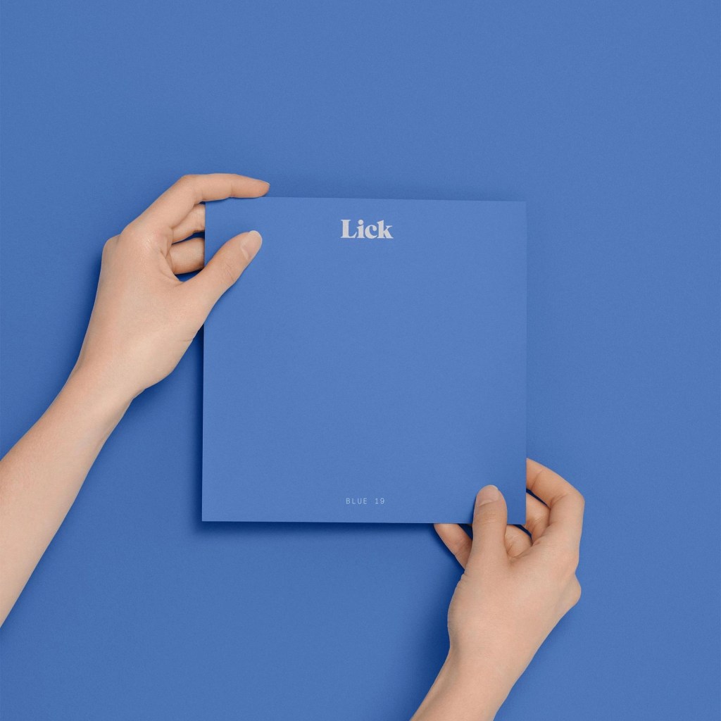
Lick did not settle for standard industry tester pots, which require plastic brushes, messy cleanups, and permanent paint streaks on structural walls. Instead, they completely re-engineered the physical asset itself into a 180 x 180mm Peel & Stick adhesive palette made with real Lick paint. Lick heavily prioritizes this sample option directly alongside standard 2.5 Litre tins within the purchasing box. This physical product innovation allows buyers to peel the color swatch off and move it around their spaces cleanly to see how it performs against different walls and shifting light gradients, completely eliminating drying time and permanent wall marks.


To scale this exploration into higher order values, Lick organizes these adhesive swatches into pre-curated sample bundles backed by reassuring, social-proofed terminology. This strategic grouping provides immediate aesthetic safety rails, transforming a blind guessing game into a curated design journey.

The ultimate structural pillar of this program is the absolute mitigation of color distortion fears. The custom icon language on the configuration flow communicates four key sensory assurances: Mess-free, Easy to move around, 100% colour accurate, and Pigment-rich colours. The Sample Guarantee explicitly reassures the user that the adhesive palette is crafted with 100% real Lick paint, ensuring absolute fidelity to the final poured product. By reinforcing this 100% color accuracy guarantee through bespoke iconography rather than generic text, Lick systemically dissolves the single greatest fear in digital interior shopping: the terror that the color rendered on a screen or paper card will entirely mismatch the physical liquid poured onto the walls.
Copywriting as an Anxiety Subtractor
Lick is unusually strong in translating high-level strategy into precise language. While most user experience designs stop at structure and most copywriters stop at words, Lick bridges both. They define exactly what needs to be said, why it matters, and precisely where it should appear in the user journey. They treat copy as an emotional antidote to design anxiety rather than basic structural labels.

Looking at the product detail page, the descriptions read like architectural psychology. Check this copy for Pink 03 – which promises a tone carefully designed to be soft and muted with comforting qualities that instantly make your shoulders drop.


This is copy explicitly engineered to alleviate a specific cognitive friction point: the fear of making a space feel cold, harsh, or mismatched. Lick uses descriptive language to define the final emotional outcome of the renovation project long before the brush touches the wall.
The combination of the copy and imagery make you keep want to keep exploring the catalog, without feeling overwhelmed by the different colors or multiple shades of grey.
One-Click Paint Calculator

Nothing halts a renovation purchase faster than spatial math anxiety, where users stress over how many tins they actually need for custom room dimensions. Lick addresses this directly in the configuration panel with an integrated text link inviting users who are unsure of their required volume to try the built-in paint calculator.
Instead of forcing the user to leave the checkout funnel to calculate square footage on a scrap of paper, the tool takes the user’s room dimensions, automatically subtracts typical window and door footprints, and determines the exact volume required. Crucially, the interface allows the user to add that precise, calculated amount to their shopping cart in a single click. This removes a massive drop-off point, prevents over-ordering which causes buyer’s remorse, stops under-ordering which destroys project momentum, and drives immediate cart confirmation.
Out-of-the-Can Collaborations
To completely separate itself from generic commodity brands, Lick utilizes highly calculated lifestyle and fashion collaborations directly inside its navigation layout, such as M.A.C, Hunter or The Soho House.
These partnerships act as a massive injection of cultural authority and premium positioning. For an anxious consumer who feels unqualified to make interior design choices, alignment with an elite global member’s club like Soho House removes all residual design anxiety. The choice is instantly validated by a premium taste-maker. The customer stops thinking about the functional cost of a can of wall coating and instead buys into a prestigious lifestyle ecosystem, removing price sensitivity and anchoring long-term brand trust.
True brand differentiation requires breaking completely free of industry conventions to capture raw cultural relevance. Lick executed this perfectly through an unexpected, out-of-the-can partnership with an exclusive collaboration with Heinz to create a limited-edition tomato ketchup red paint.

Heinz are known for their super uniquness advertising and marketing campaigns and collabs, and this one’s brilliant as well. The specifc red color can be used as walls or accent color, and Lick’s website desmonstrates both beautifully.

and how about this black and oh so sexy color for M.A.C?
Takeaways
Lick’s execution works like a rigorous product thinker, not a designer-for-hire. They zoom out to overarching business constraints and objectives, then build outward from core psychological components. Any high-consideration digital experience can replicate their methodology:
- Solve for Emotional Friction, Not Just Technical Data: Users don’t just need to know the composition of your product; they need to know how it impacts their environment. Align your messaging to directly soothe unspoken anxieties like doubt, lack of trust, and cognitive overload.
- Normalize the Visual Canvas: When users face a high-risk, deeply personal purchase decision, keep the presentation canvas completely identical to eliminate background variables. Removing contextual noise ensures the customer’s choice is driven by clear product value rather than environmental distraction. I don’t care if you’re using your AI’s platform credits like a junky as long as they look authentic and assist you creating the real-life shopping experience your customers long for.
- Create Low-Commitment Gateways: When selling an expensive or permanent item, give users an effortless micro-conversion path to sample it. Re-engineering the physical prototype into an adhesive, 100% color-accurate palette accelerates trust and builds a warm pipeline.
- Automate the Cognitive Labor: If your product requires calculations to use correctly, build that utility directly into the purchase flow. Let an algorithm handle the heavy lifting and allow for a seamless, one-click add-to-cart experience.
Dee2See by Lihi Lothan reviews DTC ecommerce experiences for brand managers and growth teams. We look at what happens between “I’m interested” and “I bought it.”