
Category: Bite Size UX
-
Bite-Size UX, Week #5
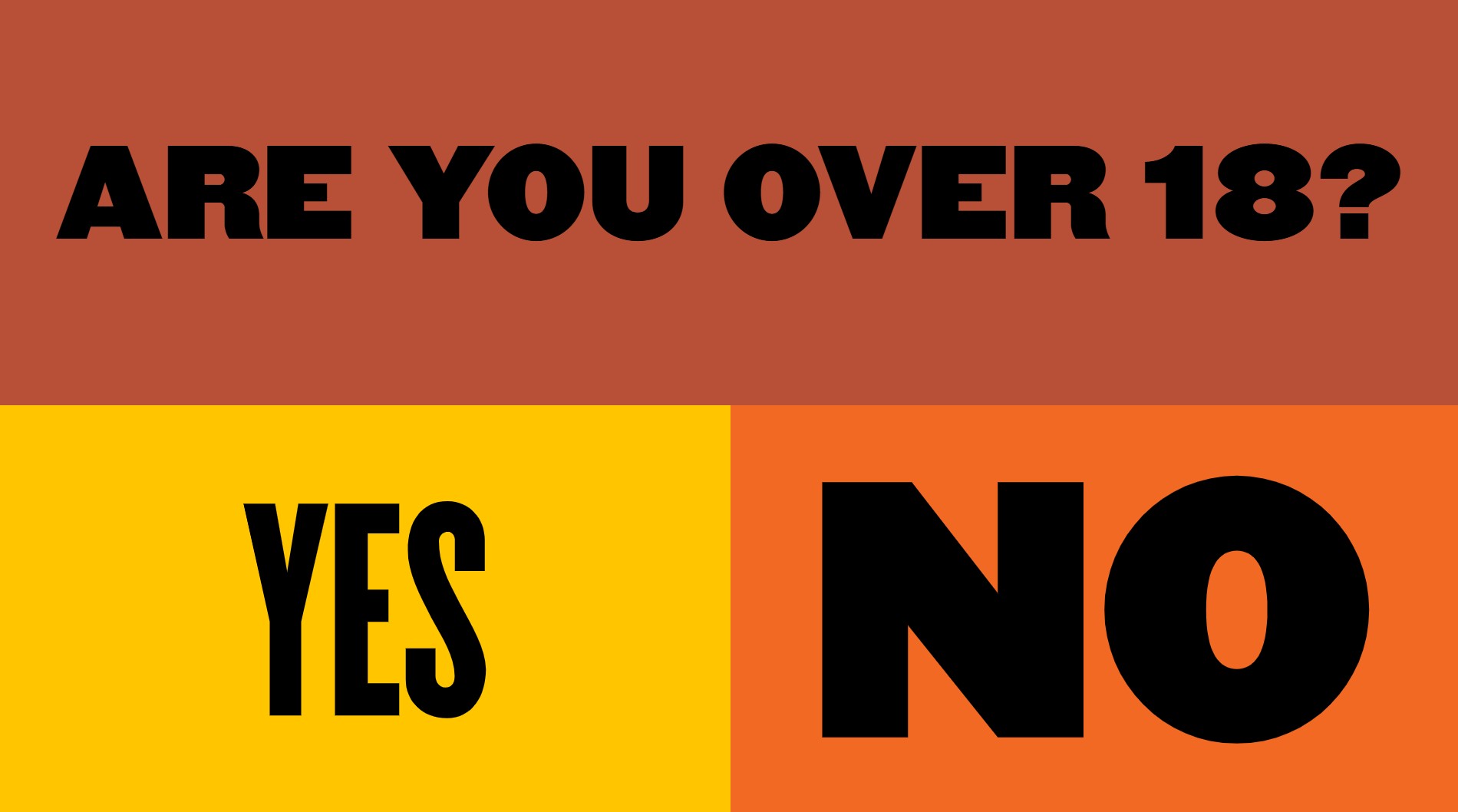
Four small decisions worth stealing: a booking form that settles who sleeps where, a calorie count you can finally picture, an age gate designed like a poster, and a name field that shows a kid’s crate before it ships.
-
Bite-Size UX, Week #4

Four small decisions worth stealing: a skillet lineup sized by what’s on the plate, a locker how-to that introduces its founder, a spec sheet you can read in half a second, a cart with a garden growing through it.
-
Bite-Size UX, Week #3
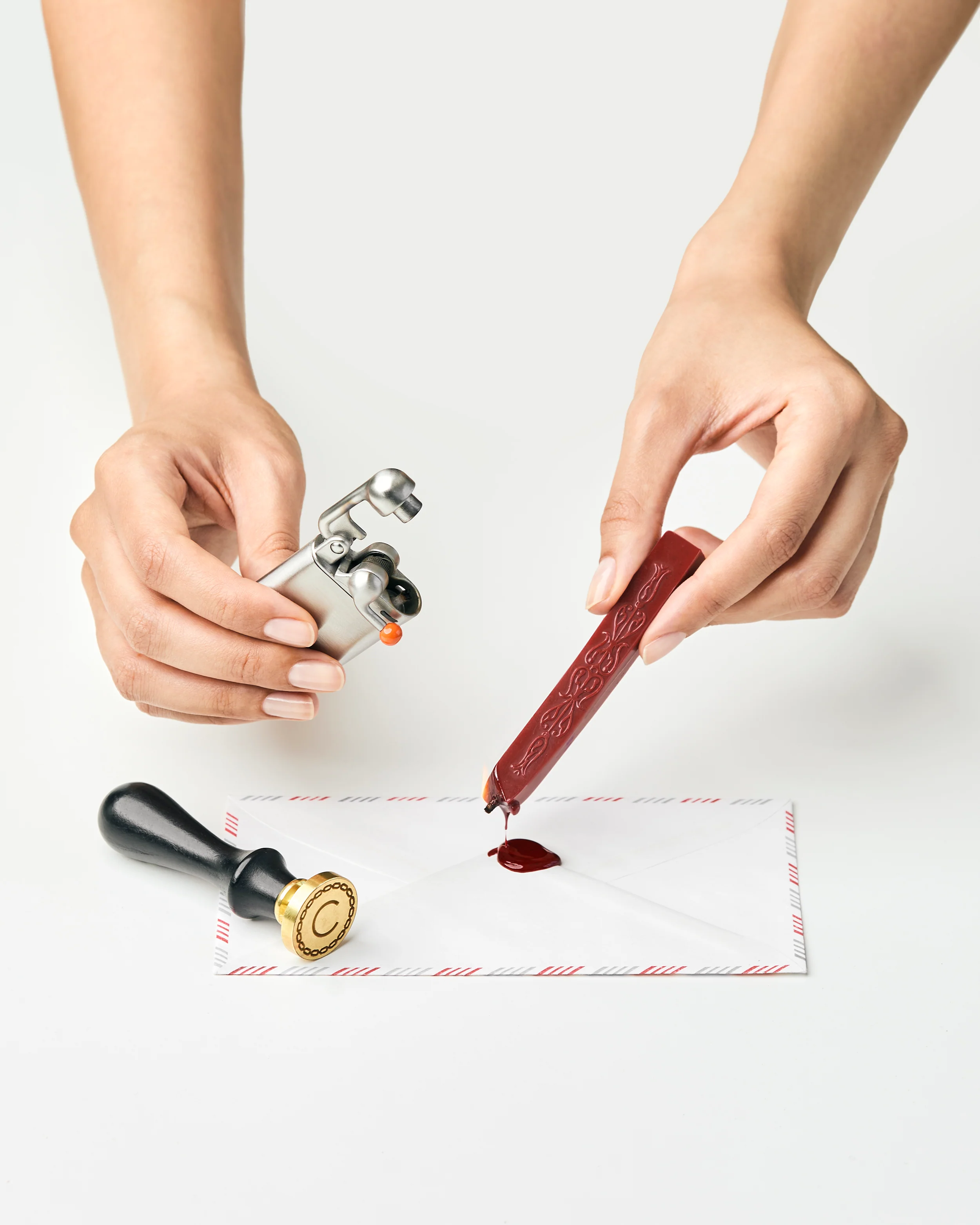
Four small decisions that do a lot of quiet work: a comparison table that sells on pronounceability instead of numbers, a banana that explains size better than any spec sheet, a lighter photographed like a ceremony instead of a tool, and a dosage chart that turns a spray count into a confession.
-
Bite-Size UX, Week #2

The difference between a site that converts and one that almost does is rarely a missing feature. It is usually a small decision someone made, or didn’t.
-
Bite-Size UX, Week #1

Four DTC brands that sweated the small stuff and got it right. A color-coded pepper store, a discount that stays in character, a honey disclaimer with a punchline, and a glass that fills as you scroll.