

Center Parcs treats “who sleeps where” as part of the booking, where most travel sites treat it as your problem. A headcount is easy to give, but a group trip is really a seating plan, and that plan usually lives in someone’s head or in a group chat until arrival day. By letting you assign guests to each cottage up front, the form carries the mental load for you, and you move to the next step knowing the arrangement works instead of hoping it does.

Dally Jelly Snack understands that a number on its own means nothing to a shopper. “10 calories” is a claim you can read and immediately forget, because nobody has a picture of it in their head. Put it next to two almonds or five kernels of popcorn and the number turns into a trade you can judge in a second, and a slightly funny one, since nobody has ever stopped at five kernels. If your product’s best feature is a figure, the job is to give it something familiar to stand beside.

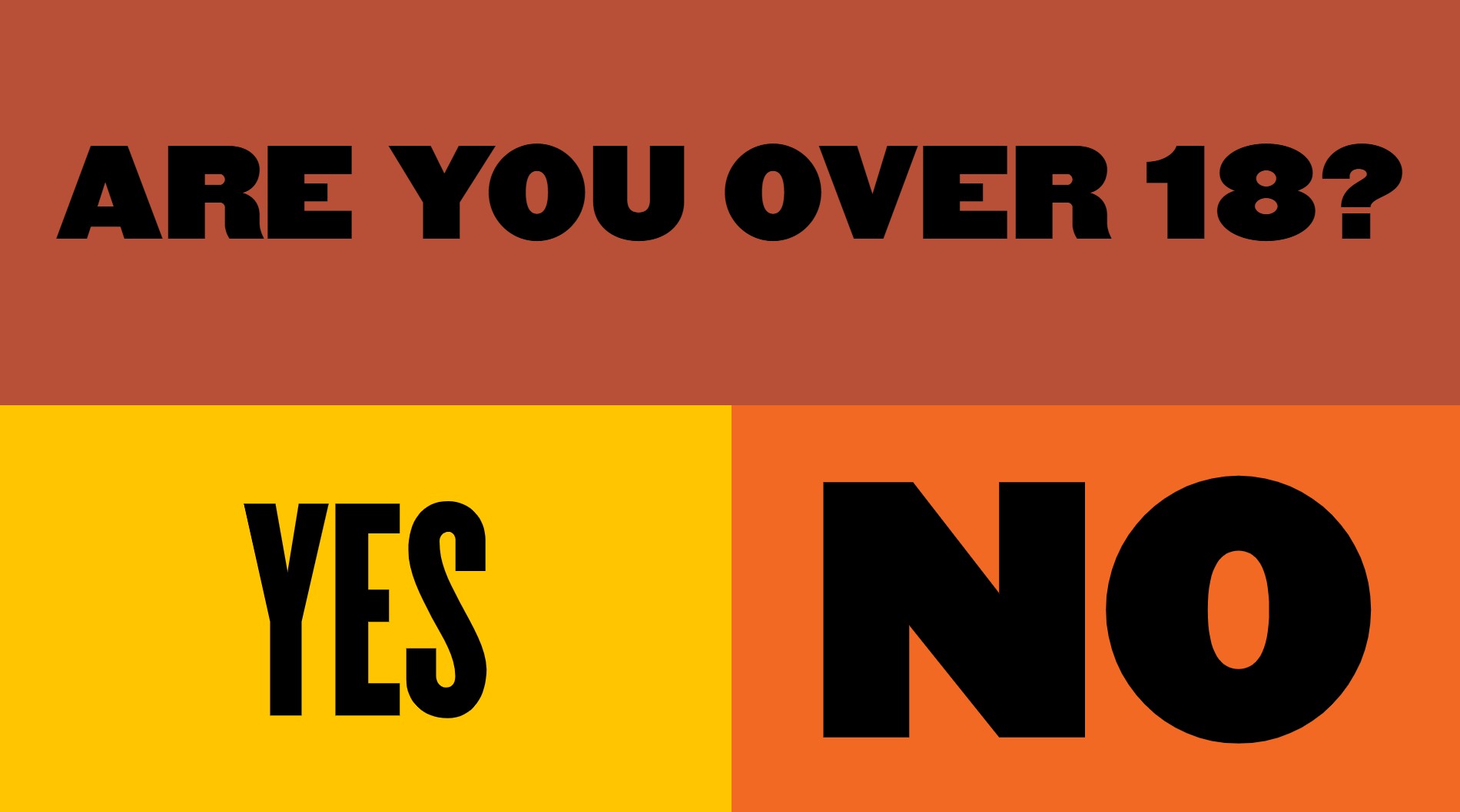
Hallertau proves that a legal obligation can still look like the brand. The age gate is the one popup an alcohol site can’t skip, and it usually arrives as a grey box in a queue of other grey boxes, cookies, newsletter, discount wheel. Here it’s designed like a poster, so the mandatory question doubles as the first impression. The screens you’re forced to show are still screens, and they deserve the same attention as the ones you chose to build.

KiwiCo takes the most administrative moment of a gift subscription, typing in the recipient’s name, and makes it the emotional one. Seeing that name on the crate turns a form field into a preview of the moment the box arrives for a kid who gets mail with their name on it. That moment is what the buyer is actually paying for, and showing it mid-checkout reminds them why they’re filling in the form at all.