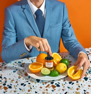

Baudie’s stinkiness level answers the “how much should I apply” question

An “Us Vs. Them” comparison table usually sells on numbers, v-signs or general terms. Backflip‘s sells on whether you can say the words out loud. “Clean & Pronounceable” versus “Need a Google” turns ingredient literacy into the actual battleground, not sugar content. Everything downstream follows that same logic: short, declarative fragments (“Incredible. Period.”) that read like something a parent would say, not a spec a brand would print.
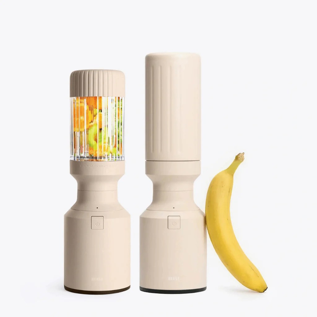
The banana isn’t a prop, it’s the only unit of measurement most people actually trust on a product page. “5.7 inches tall” requires you to picture a ruler. A banana next to a blender requires nothing, you already know exactly how big that is from your own kitchen counter. Beast uses it here to answer the one question spec sheets are bad at: will this actually fit where I want to put it, or is it secretly the size of a full countertop blender wearing a disguise.

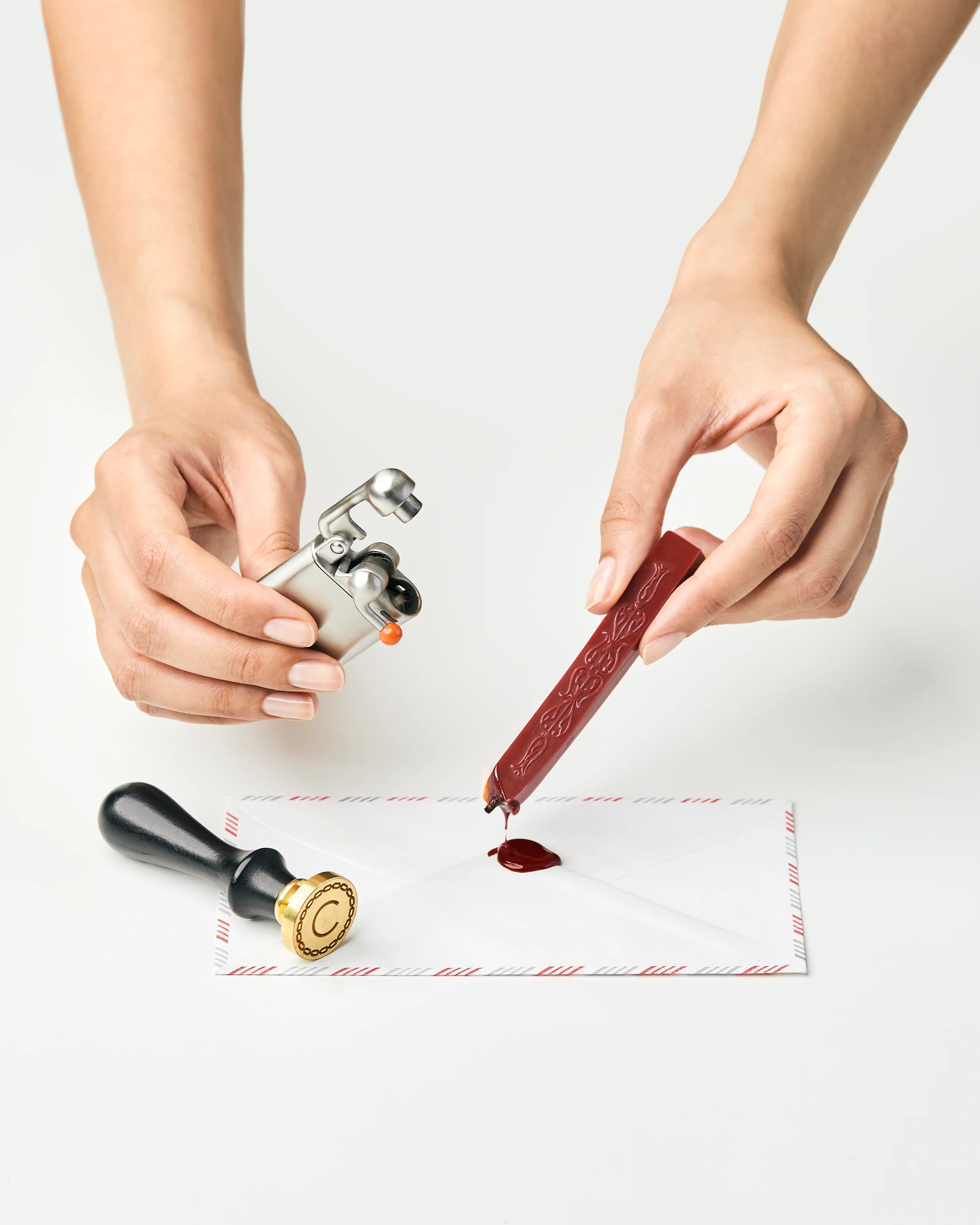
A lighter is usually the least glamorous item in any product photo, it’s often cropped out or left plain metal on white. Here it’s staged mid-action, flame lit, aimed at wax about to drip onto a sealed letter, so the ordinary butane torch reads less like a tool and more like a small ceremonial instrument. Craighill didn’t need to photograph the lighter that way. A catalog shot of the piece alone would have sold the specs. Choosing the ritual instead sells the reason you’d want the specs in the first place.
Dee2See by Lihi Lothan reviews DTC ecommerce experiences for brand managers and growth teams. We look at what happens between “I’m interested” and “I bought it.”