
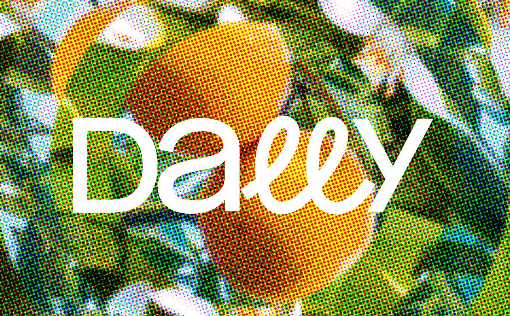
Dally makes hand wash. Three scents and a bundle set anchor the store, and the merch around it never breaks from the bit either: letterpress journals, totes named No Hurries and Slow Poke, pens called Slow Rolling, postcards branded Snail Mail, a bookmark called Easy Breezy. It’s the work of Kevin and Liz Egan, a husband and wife team working out of New York, and the whole brand sits inside one old fashioned verb: to dally, which, according to Merriam-Webster, means to linger, to waste time, to move slowly, or to treat something without serious purpose.
That’s a lovely idea for a mood board and a genuinely tricky one for an ecommerce store, because the platform itself is built for speed. Add to cart, checkout, done, three clicks and you’re out the door. Dally runs on the same Shopify structure most DTC brands reach for, the one built for exactly that kind of speed, and instead of designing around the constraint quietly, made it the whole demonstration. If the promise is slowing people down, the storefront had better slow down too, not just say so in the About page copy.
Scrolllllling
Scroll the homepage and the wordmark grows a limb. At the top of the page it reads “Daℓℓy,” compact and controlled, but keep scrolling and the double L stretches, loop after loop, until by the bottom of the page it’s ballooned into something closer to “Daℓℓℓℓℓℓℓℓℓℓℓℓy.” Nobody had to write a paragraph about slowing down for this to land, the logo does the explaining, and the longer you linger on the page, the longer the word gets, which is a fairly literal translation of what “to dally” means in the first place: to take longer than you strictly need to.
Most brands treat their name as furniture, something to plant in the header and leave alone. Dally treats it as a live demonstration, one that costs nothing in copywriting and asks nothing of the customer beyond continuing to do what they were already doing.
Seize The Slow
There’s a specific kind of stillness Dally is chasing, the kind you get lying in an actual field with nothing scheduled, listening to music which takes you far away, in no hurry to get anywhere. Scroll through the circles and that’s exactly what turns over on screen: grass and sky dissolving into themselves for Barefoot in the Grass, one wave folding into the next for Rolling Wave, sunlight caught in citrus leaves for Naps in the Grove. None of it goes anywhere. No animation to sit through so the real content loads, no beginning or end, just weather, looping the way a good daydream does once you’ve stopped checking the clock.

Then the type curves into the same rhythm. Curved type takes longer to read than straight type, your eye has to follow the bend instead of cutting a line across it, and Dally puts that delay to work everywhere it can. On the bottle, the scent name wraps rather than sits flat, so reading it becomes a small, unhurried act instead of a glance. On the shelf page, that same delay shows up as repetition: Rolling Wave’s heading doesn’t stop at its own name, it rolls into itself three times over, taking noticeably longer to say than a single word would, like the wave itself refusing to just be one wave. The nav two inches above drops the trick entirely and calls it plain Rolling Wave, because the nav’s only job is getting you somewhere fast. The site slows down exactly where it wants you to linger, and gets out of your way everywhere else.

Parking Your Ears

Those music lines under the circles aren’t just mood copy either. Dally Playlists is its own item in the main nav, a dedicated page with all three playlists sitting side by side: “Help slow things down by parking your ears on one of our 3 unique playlists. Simply hit shuffle and let the curated music set the pace.” And on the product pages themselves, each scent links to its own playlist again, this time positioned right next to the Add to Cart button.
That’s a strange thing to put on a purchase page. The button you actually want someone to press sits three inches from a button that sends them to a different app entirely, mid-decision, right when a conversion-minded site would be doing everything possible to keep them on the page. But it tracks completely with the premise. A brand built around not rushing has to be willing to lose you for four minutes to a playlist, or the whole thing is just a tagline.
It’s The Small Things

Dally’s website is full of small yet delightful elements. Add a few items to the cart and the icon doesn’t just tick up a number, it shows icons of the products you added, each rendered in the color assigned to its scent.

The Contact Us page features a list of slow communication options, next to email addresses, if you need a quick one. I’ll try Yodeling next time, I promise. And Love Notes, of course.
There’s also one delight on the shopping cart modal, next to the gifting options, it says “Is this order a gift? Add a gift note here. Easy breezy.” Yes, we know – don’t touch the platform’s important pages, shopping cart included, but see what happens when you just add two words, doing more branding work than most brands manage on their homepage hero.
The discount code in the announcement bar reads NoHurries10, not WELCOME10, not SAVE10, not any of the fifty templated codes that ship default with a Shopify theme. Even the least romantic piece of ecommerce infrastructure, the banner that exists purely to announce a percentage off, got the same treatment as the wordmark.
Pumped My Ride!

And now – this really blew my mind – if you scroll slowly enough and pay attention to details, there’s a way to get to an Easter Egg page. I’m not going to tell you what happens when you tap the pump (mobile version only) or how to get there. But trust me, what’s waiting underneath is one of the most basic, most overused mechanics in ecommerce, dressed up so well you forget to mind that it’s basic at all. Dally is proof that even the most ordinary of ecommerce basics can become a genuine delight once someone bothers to make it feel like a discovery instead of a demand.
Takeaways:
-
Make your smallest field say something. The order note, the shipping confirmation, the 404 page, they’re all real estate nobody else is fighting for. Start with whichever one gets read the least on your own site and give it one line of actual voice.
-
Let your name misbehave once. If your brand has a word it keeps repeating, a verb, a mood, a promise, find one place on the site where the interface itself can perform that word instead of stating it.
-
Give your discount code the same edit your hero copy got. A generic promo code is a missed line sitting in the one banner every visitor sees first. Rename it before your next campaign, not just your homepage headline.
Dee2See by Lihi Lothan reviews DTC ecommerce experiences for brand managers and growth teams. We look at what happens between “I’m interested” and “I bought it.”