
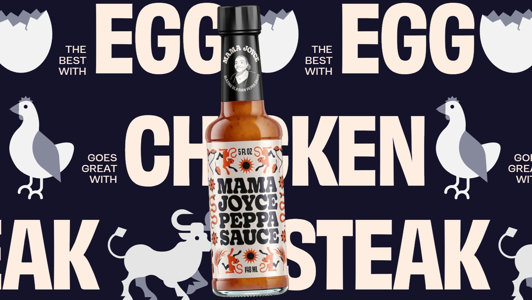
The DTC websites reviewed here are all full websites, with the regular homepage, product pages, about section… This post, however, is going to demonstrate how much personality can be injected into a one pager.
Another thing I keep talking about is visual hierarchy and basic UX rules, but once in a while I stumble upon websites that defy all laws and rules, in a most delightful way – and this is one of these events.
Mama Joyce‘s one-pager, one-product website has an absurd amount of elements, filling all the pixels on the screen, and still this is such an amazing shopping experience, so full and condensed and surprising. It sort of feels like actually tasting the product.
It’s Getting Hot In Here

The sauce gets exactly one hard number: 2,400 SHU (Scoville Heat Units, the unit of measurement used to quantify the spiciness or “heat” of chili peppers), stated plainly, twice.
Even the loading screen is part of the action: Instead of a generic spinner, it’s an icon of a flame which grows bigger along with the rising temperatures. A wait state most sites treat as dead air becomes one more chance to stay in character.
No Heated Rivalry

Having so many elements on one page and still making it look this beautiful is a real masterpiece (shoutout to Vaan Group!). There’s so much going on here, but still the main (and only) CTA button, “BUY NOW”, has no competition. You can’t miss its rotating text and its look, like an X-Ray bubble looping across the screen before you’ve even scrolled past the bottle, and it never really stops. The sauce bottle and the CTA button scroll down, changing their location as you scroll, and adding interest and a visual breaking point with the orange sauce against the dichromatic content that eases the otherwise busy screen. Most product pages put one CTA in a sticky bar and call it done. This one refuses to let the buy prompt live in a single place. It’s baked into the wallpaper, so there’s no scroll depth on the page where a purchase isn’t already on offer, without a single button following you around.
Every screen on this page is doing at least four things at once. A ticker loops overhead, a headline sits in oversized type behind everything, a paragraph of actual copy lives inside a bordered card, and somewhere an illustrated detail, a wink, a snake, a hand mill, is quietly doing its own thing. On paper that’s a recipe for noise. On screen it reads as one coherent, slightly unhinged world, because the palette never moves. The loud stuff, the tickers, the oversized single-word backgrounds, is built to be skimmed as texture, not read as copy. The quiet stuff, sitting in its own little box every time, is where the actual sentences are. You’re never asked to read everything on the screen at once. You’re asked to read the box, and let the rest hum behind it. That’s what makes a page this dense feel like more instead of like too much.

The mobile version works the same way, with a Click Me button accompanying you all the way down the page.
WTF is Guyana

The page stops to teach you where Guyana is before you’ve learned a single fact about the sauce itself, with the visual treatment similar to the other elements on the page. The lesson isn’t a detour from the sales pitch. It is the sales pitch.
Don’t Try It With Cereal

The page tells you what to put this on (egg, chicken, steak) and then, later, tells you what to keep it away from (mint, raspberry, cereal), in the same repeating typography, icons and minimal animations treatment. It’s the only real usage guidance on the entire site, no recipe section, no ingredient breakdown, and it does double duty as the funniest writing on the page.

Buy The Damn Stuff

Eventually the whole thing funnels into a cart drawer: one product, one price, an $18 two-pack, free shipping, nothing to compare or configure. That’s the entire structural ambition of the page collapsed into one screen, and it’s honest about it.

One thing though: the actual checkout page is missing. I was also looking for this brand’s existence on other social platforms, but couldn’t find any. Even if this brand is no longer active, this is a great lesson showing how one pagers, done right, can create an amazing shopping experience.
Takeaways:
-
Spread your CTA into the page’s texture, not just the nav bar. In practice, count how many scroll stops on your PDP currently offer zero path to purchase, and put a small buy prompt at every third one instead of relying on a single sticky button to do all the work.
-
Write the negative use case, not just the positive one. In practice, next to whatever “pairs well with” or “goes great with” module you already have, add a short “don’t ruin it with” list in the same voice. It costs almost nothing to write and does more for personality than another testimonial.
Dee2See by Lihi Lothan reviews DTC ecommerce experiences for brand managers and growth teams. We look at what happens between “I’m interested” and “I bought it.”


